Category Archives: Uncategorized

Assignment two


Assignment two

Make a drawing of subject of your choice using the subject itself, or tools constructed from the subject, dipped in or paint.

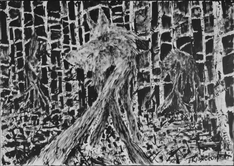
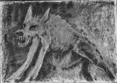
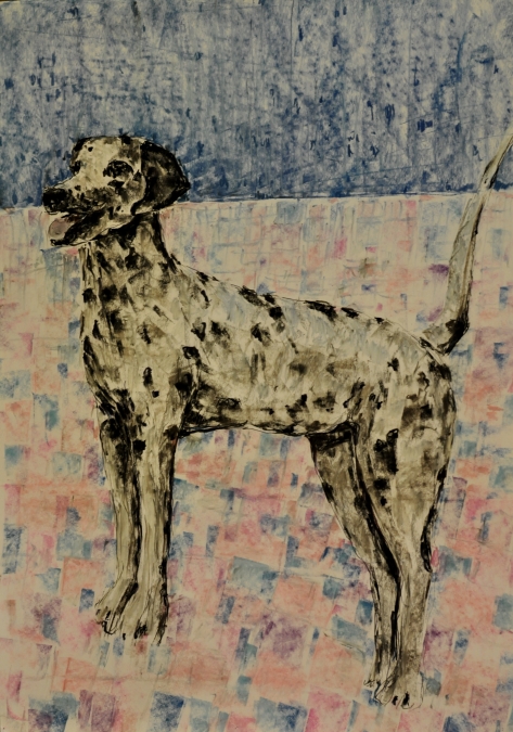
I thought about this assignment quite accidentally while working on the first exercise in which I drew several drawings with wolves. I spotted a few wolf photos in the woods that looked like they were hunting or ready to attack. From the beginning, attention was drawn to the proportions of the front legs compared to with the rest of the body which seemed larger, the perspective from which they were photographed gave a strange effect, the wolf’s front was very massive, the rest was hiding in the background. I deliberately searched for several photos that use fish eye perspectives.

I found the tools that work well during the work would be black ink, the forest/trees and everything that will create a background will be made from bamboo stick or other wooden sticks available to me and to draw a wolf fur I will use an old brush with hard hair, I found I can use the dry brush method, I think that these tools are consistent with the form included in the subject of wooden elements for trees and a hair brush for the definition of fur.

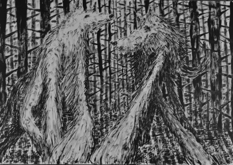
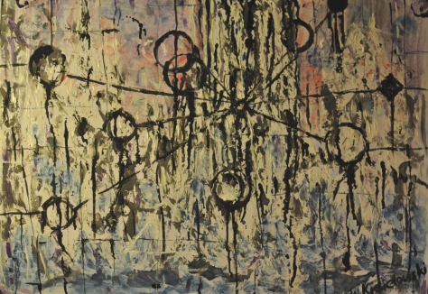
My first approach was to draw a wolf in the same composition which I presented in the first project, I wanted to narrate a very readable sketch so that he would introduce a kind of monster from the forest or a form of the devil, deliberately enlarging his limbs and deforming the rest of the body, such an eclectic figure it’s very interesting,

DSC_1893

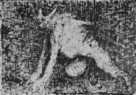
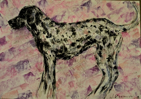
So I decided to broaden the subject and draw the wolf’s character from the front in this very different perspective. Whereas I mentioned earlier, the legs seem to be longer, I decided to make them more alive while remaining in this devilish narrative.

In the background, I decided to draw the next wolves so far in a very eclectic form, and it was my big mistake that I would start thinking how to put these creatures in space. I should have suggested earlier how to better integrate wolves into this space but in the ink drawing it was already too late to fix it.

DSC_1891

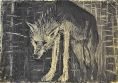
I decided to draw the next work changing the topic from a dangerous wolf to the figure of a lightweight polar bear I found a few objects where the proportions of front or rear legs relative to the rest of the body would seem abnormal, and in the same eclectic narrative idea how to better place this object in background. Completely accidentally I started running out of ink, so I decided to dilute it with water, which allowed me to get a better effect while painting the fur.

DSC_1888

To make the whole composition more dynamic I added a very dark shadow in the middle so that even if the polar bear appears to be drawn in a very soft way, the whole composition is more contrasting and vivid.

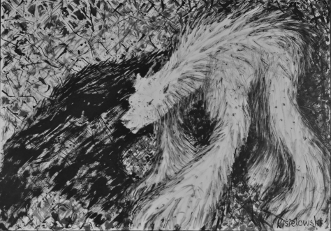
The next drawing was a similar figure of a bear, but I wanted it to exist in a different way I wanted it to emerge from the trees so that the trees and bear were part of the foreground and see what the effect will be, unfortunately I failed to get a similar atmosphere as in the previous works. The bear is not as visible as the figures in the previous drawings, I decided that I would come back to this composition which would require more experience.

DSC_1886


Then I decided to try to draw a group of polar bears as in the case of wolves.

DSC_1884

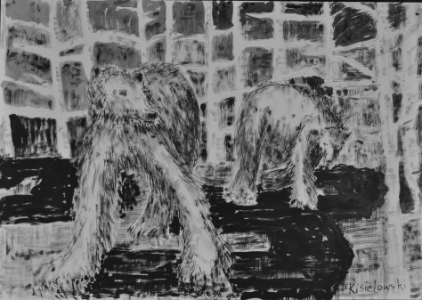
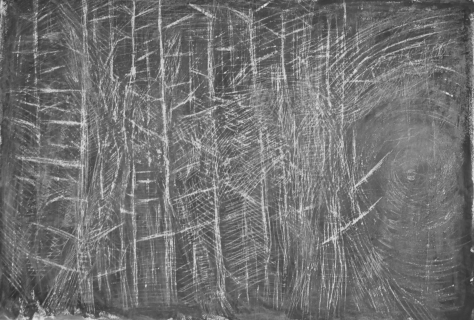
In the foreground, big and in the middle, smaller, after drawing I decided that the whole narrative has changed here giving an atmosphere of terror, as everything seems more stable and soft, boring in one word so that I decided to create atmosphere and add some more black parts imagining shadows in the middle of the drawing in a very geometrical form, and this geometrical form slowly expanded to draw the forest in the background. The dry brush created a very interesting structure when drawing the forest in the background, I think I didn’t use anything else but the other tools because the relationship between the figures in the first plan and what is in the middle and in the background seems very interesting, contrasting and similar at the same time

In the final work,

DSC_1882

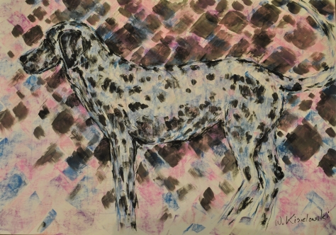
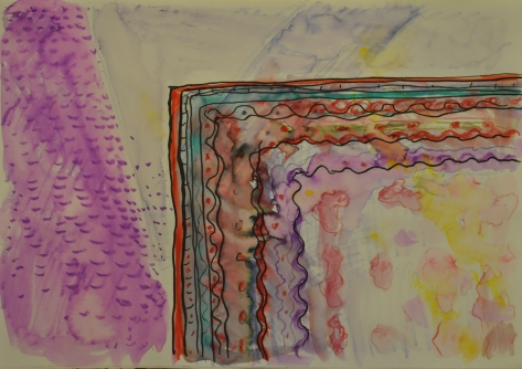
I decided to use two different narrative effects and combine them into one composition, soft polar bears and a devilish wolf as foreground characters and a less aggressive forest in the background but made in a way that focuses our attention, some kind of perspective tree stand projecting the same fish eye. Of course, I made a womanish form to the wolf by slimming her figure, but the length of the lap and fur on them is drawn in a different way than in a man, it is whiter and softer, less aggressive. I think that during this whole work on this project I underwent some kind of analysis and experimented by creating various forms of compositions with the use of quite inaccurate non-precision tools. When using wooden sticks, accidents can happen, I tried to rub them or use them. I worked on a large format on an easel, keeping the ink on the stick just made it difficult. With a stick, I could only draw in a specific direction. I think that throughout this project I used the experience I learned during the exercises, but I devoted all my attention to building an appropriate narrative. So, the narrative is the leitmotif and then the work on the composition of the image, I paid particular attention to maintaining a proper relationship between what is happening in the foreground and what is in the background. I have considered the behavior of these relationships as a very important element of my work. Did I succeeded? I do not know, but I estimate that my work meets all the criteria and I am determined to present for assignments.

Part two

Part two

Material properties

Project 1: Space, depth and volume

Work on this project I began with drawing a few small drawings. I decided to familiarize myself with the method described in the exercise, I often used rubber to erase or strain lines when working with charcoal, but I never covered the whole paper and did not use this method. Immediately I noticed that it will be difficult to present the depth using a rubber, when I started to erase the surface, the surface started to form lines I tried to avoid and to disassemble the drawing so that the outlines were less visible.

Then I decided to continue this exercise in a larger A1 format, as I thought it would be easier for me to present the atmosphere space, depth, third dimension in a more complex format I can add more detail and the rubber is less precise so when I use it I must have dealt with small precise elements. I started drawing wolf photos found on the internet, unfortunately my type of work did not allow me to feel a delicate tonal analysis of space, I made a very linear drawing which made it difficult for me and started asking myself if I could do it right.

DSC_1900

In the next drawing, I decided to cover the paper with a much blacker layer of charcoal and work with rubber, using it more flatly.DSC_1895


The effect is not the best, despite the fact that I analyzed how to show shaded dark places, the wolf does not disappear in space. I decided to screw up again and not take into account that a very linear line arises, but look in these lines for a differentiation, I decided that I will use random linear elements in this drawing, but I will try to make them so that they form a kind of space depth.

DSC_1897

I use the lines in a very different way, more contrasted and I check how the space is built in this drawing.

Project 2:

Mark – making materials

This exercise made me the most difficult in terms of the organization of work, I thought it would be very simple to cover a piece of paper with paint and simply using some tool to scrape some form of drawing. I covered with a sheet of paper a wax crayons and then I painted the whole black tempera, thinking when scratching I got to the first layer but the paper turned out to be too thin and I managed to get only to the white part of the paper.

DSC_1898

I began to analyze the work of Rembrandt and came to the conclusion that most often this method is used in painting, often painting inadvertently scrapes a part of paint to get into another layer but looking at the drawings Rembrandt or Caravaggio it is difficult to see this method looking only at reproductions. During the previous exercise I used gum to erase the part and get some lines it was more controllable.

Then I screwed up with oil paint on a harder backing, but as we know the paint dries slowly, so I scraped off using sticks and a knife. It was very spontaneous and showed different effects, but can you consider it a drawing?

The last attempt was covered a sheet of paper with acrylic paint and then the second layer was coated with wax. In this way I could not get to the first layer, the colors of the layers I chose in a similar tone I wanted to avoid contrast I wanted everything to be soiled to scrape lines they did not look like they were made using conventional drawing tools. I think that in one of these works an interesting kind of space arose only because of the use of this method. But personally, I cannot get any more into this kind of technique, I certainly used it or I will use it during drawing, but I would prefer that this kind of mark making was rather more spontaneously, accidentally while creating a drawing.


Project 3:

Narrative

For a long time, I have been pondering how to create a kind of portrait or tell a story of a person while not denouncing himself. The first was to create a self-portrait. I drew an overfilled ashtray because I am a cigarette smoker. But I came to the conclusion that it may apply to every man and the subject itself may be some form of anti-smoking campaign.

DSC_1908

I decided to bring up the story of two lovers in the room, a frequent view of the cinema known from the television, scattered underwear in the room, a white shirt slung over a chair, the light turned off. I repeated this topic trying to present one lover in the form of llingerie and another lover in the form of a white shirt.

Then I came to the conclusion of the bra of my wife which I drew very attractivelyon the cushions of my sofa where you can find a colorful blanket of fur tassels and the cushions themselves are patterned. I decided to screw up again and draw this interesting structure and I thought so that I create a portrait of my wife who loves these colorful pillows with a variety of patterns on the sofa and how often happens in the privacy of the home can meet with the elegant lingerie leans freely thrown on the sofa.


I realize that this composition can be differently read but for me personally is a real kind of my wife portrait. Unfortunately, only I can describe whose portrait is only my story, I am the person who created such narratives and here comes the real problem for the future: how to convince the recipient to receive our work in the same way. I think that a series of works would be needed to guide the recipient to the same thinking direction

CORNELIA PARKER

Research the work of Cornelia Parker.  Make notes in your own words in response to the following:

“What do you think Parker is trying to do in her piece “Poison and Antidote Drawing” (2010)?”

“Poison and Antidote Drawing” is created using rattlesnake venom and black ink, anti-venom and white ink.  “Parker often uses bits of her subject to make her art work.  Why do you think she does this?”

“How do you think it feels to stand in the presence of artworks that are constructed from original objects of great cultural significance? How does that differ from, say, standing in
front of a painting of the same object?”

Before I started to analyze her work, I started to search for information about the technique that was used to create the series Poison and Antitode Drawing, I began to study the technique called Decalcomania.

Decalcomania is a blotting process whereby paint is squeezed between two surfaces to create a mirror image

The most common example of decalcomania involves applying paint to paper then folding it, applying pressure and then unfolding the paper to reveal a mirror pattern.

Decalcomania is most commonly associated with the surrealist painters Max Ernst and Oscar Dominguez, who would use the technique and then turn the resulting patterns into landscapes and mythical creatures.

The first thing I thought was that the creation of this type of work requires great control over the material that it used. I know that these works arose at the turn of several years. With the help of an extremely symmetrical composition, he creates two-dimensional visions of the world of black and white and opposites, as in Chinese Ying and Yang, he exists without himself.

Of course, there are other shades of white or other shades of black but are attracted or repelled in a way more or less determined by their opposites. All the rest remains in untouched white in all the corners. Parker showed two worlds: good and evil. Angels and demons can move in this narrative. I know that the opposites are a theme, but we only see this theme once we look at the “Poison and Antidote” series. Here the result of this narrative is understood, while if you look at the work separately the narration is different. She presented Hitler and Sigmund Freud in opposite ways, and painted them in a contradictory manner as opposed to an allied choice. They are contradictory in the way she analysed them, as a scientist or as a leader, or a war criminal, or perhaps Freud is not liable in the way that his person and achievements can be treated in a different way. She presents two people and the viewers have to decide which work is more attractive.

White antidote, other black poison and everything between fights but there are some organic forms between which distract our attention and force us to think in what direction we are going, where we go a certain form of play or some kind of scientific test in which we enter watching her creativity.

It is this very intellectually developed form of perceiving her creativity, an attempt to guess the narrative. We start looking for a concept and forget about the very form of space where we look at the object, what is it without this idea of ​​conception, narration and what impressions in us causes.

Personally, I’m little to blame this type of creation, which is why I’ve looked at an early series.

Pornographic Drawing

Cornelia Parker
Pornographic Drawing 1996
Ferric oxide on paper
support: 560 x 560 mm

https://www.tate.org.uk/context-comment/articles/deliberate-accident-art


Where the author uses a similarly symmetric technique, but the narrative was definitely more expressive and made a strong note with the title, if drawings could be worth paying attention to, but this obvious reference to our biological organs stuck in my mind, irritated me and I was not able to think logically about the series that reminds me X-ray photographs of information from my doctor.

All this irritation, riddles, overtones, fun with our mind causes that we start to wonder what form to read her works in. Duality is a constant forcing us to think without re-relax, despite the fact that her compositions seem very stable, motionless, monochromatic which should calm us down Unfortunately, it irritates us in a way or is it not fun?

I asked why she used poison in her work if she wanted to attract our attention?

Is it a kind of thinking that will force us to think in the right direction, to counteract the antidote to receive in a positive direction? Which direction is positive, this continuous game that forces us to focus more closely. It is worth considering the history and significance of these objects which created the material that makes up the meaning of the objects or persons to whom it refers for sure this form of transformation and some kind of transfer of a certain reality is not the same as if we were looking at real objects, artistic form compels us to see a more complex one, enriches our perceptions and evokes feelings. Artistic form can provoke us to think differently. When we see a real object, our feelings are more obvious. I always suspect that view of the image of the blue sea will cause us unforgettable emotions but the view of the painted view of the sea will provoke us to some emotions and that’s why the artist can use this material to poison or bring back some feelings that are in us. The idea of ​​ink poisoning can be considered a kind of joke where someone accidentally or intentionally gave poison in the letters, it was a method of the past. It was in medieval times.

But I refer to the Rorschach test as very dangerous. The artist wants to do something dangerous in a psychological way. We should be invited to such a psychological game and not forced to react in one way or another, that is why adding poison is intentional, without poison these works would have another meaning and definitely less appreciation.


Rorschach test
Rorschach test Inkblot similar to those used in the Rorschach test.

PAINTING AND/AS PERFOMANCE

ASSIGNMENT ONE

While working on this project I became acquainted with the creativity of artists such as Jackson Pollock , Jessica Warboys, Shen Wei and I have learnt a lot from them in the field of physical approach to work, and their emotional approach to creative work like their activity during performances, the way they handle random events that arise during creation so as to achieve the desired effect, satisfying our expectations and arousing emotions. Everyone has their own individual approach, and you can get a lot out of them, but whether it should be followed or imitated is the question.

During this project, I have the impression that it has crossed a certain limit. I felt compelled to move away from figurative painting to the abstraction which is a well-known art form, but whether it reflects how I want to create – I do not know. In a word, it is a completely new field of expression and a medium of communication. How I used it – I certainly did not settle certain behaviors in some events, but it is more important to watch in front of the computer monitor because in the home it would be very complicated. But the impression of this kind of strange new impressions with which I can get to work, something always remains, however, from some experiments we never fail to give us this message is very clear.

Speaking of the fact that this project, in a sense, rejects figurative painting in favour of more spectacular impressions because abstract painting forces us to read out of a different dimensions and looks into a different sense in us. In abstract paintings we all see something different. Strangely, my task was to draw conclusions from this kind of creativity and use them to create a series of images. I do not know if the series should have a common theme or if the following images should have some type of relationship with me. I have decided to give them the same subject.

I decided to create a very imaginary series of images with a common undertone.

While working on the exercise with diagrams I created a strange landscape –

DSC_1836

I decided to use this theme and used a variety of experimental techniques to create a series of images. In this work I present a certain creative process and show the skills and experiences I acquired during the exercises, and during the analysis of the works of artists from the group mentioned as recommended, but also artists from outside the circle such as Cecily Brown , Maria Moser.

I tried to compose a coherent relationship between these creations with both of the materials that I am using: the family of paints and colours and the general nature of the work created. The recipient then has a clear reception and understands the series of work that evaluates in a different way.

I tried to make the work, in my opinion, comply with the assessment criteria. I technically and visually demonstrated the right level, made myself the author as a creative artist who does not experiment, and used my imagination in a proper way and I can arouse interest in his work.

I called the whole series of Catharsis Landscape.

Catharsis (from Greek κάθαρσις katharsis meaning “purification” or “cleansing”) is the purification and purgation of emotions—particularly pity and fear—through art[1] or any extreme change in emotion that results in renewal and restoration.


I think this name is very adequate and has a real relationship with my project. I think naming my work this way is a good idea.

In the first series of my creations, the picture shows a very saturated, red landscape in which I spread the sponge root, then using a painting knife I spread the excess paint on paper. I then used a brush and pastels to add aggressive spectacular forms to increase the drama of the work and give it a proper, often random, expression

DSC_1838

I then decided to change the colour and used the same tools to check how the nature of this work will change in a different shade. I wanted to see if the dramatic effect on the creation will increase or decrease, or if our perception will change through the warmer shades.

DSC_1840

Then I decided to refer to the fourth project and to take the whole process of painting with no brush off. In this work I used a painting knife and an inpasto gel mixed with acrylic. I repeatedly used the previous work as a base, but I tried to make the whole process more painterly and I elaborated the drawing in favour of the brush. Sometimes wiping off spilt paint on the surface created a pretty and interesting structure. I took care of the colour directions and created the atmosphere of vibration. It seems that the colours go in all directions, but I have control over that. Certain directions of these vibrations are stronger and they make my work stronger, because it uses the colour in a more free way. It is difficult to describe but many of these forms were very random and created accidentally in control.

DSC_1844

Then I decided to change the format to portrait and concentrate on my imaginary building, referring to the first exercise where we had to draw in a more painterly way, using lines as a connecting element. In a similar manner, I turned a wide flat brush in which I deprived a part of the hair, dipped in paint, and cut the lines in a very controlled delicate way. Background  was painted in a similar way as the first and second painting. I think I created an interesting rotating object, but I am not sure about the position in which we should see it, the landscape or portrait. I do not know which one would be more readable.

DSC_1843

In the next image, I returned to the exercise with a diagram and decided to paint a king of futuristic map of tubular elements, with geometrical forms that guide us in the soil of the picture, whether it is a grid, construction, or a map. It was my intention of putting a blind trap for the recipient, and to create an image that evokes thought. From a compositional point of view, I think it came out very well. The picture seems to be a more interesting type of grid that divides the picture into parts. Thanks to this we can concentrate on particular parts of the image separately, a large plane of a bold colour could have overwhelmed us. It’s such an industrial pink landscape with distraction in the foreground.

DSC_1834

The last of the presented projects is the image referring to exercise 1.3 where I used plastering putty to build the first layer after which I allowed to run very diluted paint, using glassware and after I left my prints in the form of a circle after wetting. I then connected geometrical elements with lines and tried to leave the dissolved paint on the surface, sprinkling it gently with a brush. I think that the geometry forms would be considered as a kind of cartographic element. I took care of it coloristically with a paint covered sponge squeezed to fill empty spaces, retouching only some elements with a brush.

DSC_1879

I was very challenged with this whole task due to the fact that I work at home without having the opportunity to fully meet all expectations, but at the same time I would like to make my work so irrelevant that I would be diverted to a completely different dimension in thinking about creating expression, emotion, or physical contact with the art that the latter is certainly lacking in my works, but the most important thing is letting myself be aware of this might be an opportunity to express myself fully.

Painting and/as performance


Exercise1: Smallest to largest reach

While working on this project, I first became acquainted with the creative output of artists such as Tony Orrico, Sehen Wei, Jackson Pollock. I admit that his work has made a huge impression on me. But I decided that I would give in to some kind of experiment and start working according to the methods described in the exercise. So, I started to work using oil pastels on paper, using only the pressure of the finger then going to the wrist and then expressing my injections with an increasingly dynamic form moving from the shoulder, etc,. I admit that I performed with discipline. I was unconvinced about creating some forms, that I did not scratch any particular elements, but I gave in a very relaxed form to some kind of experiment, namely, I allowed my hands to move in an uncontrolled way after contact with paper. I controlled only the strength of my hands. Of course, dynamism and line strength can vary, it depends on the mood of the force with which we express our emotions or the external conditions of the music we listen to. All this has a great outcome on the effect that I made during the exercise. I was relaxed and expressed myself in a delicate way. I am not sure if I completed this task, or if I should show something more, like giving into the emotion according to the recommendations and the method of work that determined this exercise. But I certainly believe that I allowed my hand to leave marks only in the way described in the exercise.

PROJECT 2 ALTERNATIVE PAINTING TOOLS- GESTURE -THROW,DRIP,SPLASH,SCATER,GRAVITY

While working on this exercise I made a number of experiments – I spilled the spilled paint on the paper, I spread the excess paint using a palette knife, scraped off the amount of paint, leaving different marks. I added inpasto gel to the paint, for example, in order to thicken layer that work and then scratch the part. After some experiments I concluded that I had to plan what I wanted to present in my final job. This kind of work is very experimental and requires a specific place for the work of a real studio. Unfortunately, I have to think how all these tasks adapt to home conditions and it’s very difficult; I need to specify what material I will work on, what kind of paint to use, etc. When working on paper using acrylic paints, the effect of my work will be different than if I used more lacquering paints on a smoother slippery surface.

So I came to the conclusion that I need to adjust my terms about working on this project. I need to compromise on the canvas and allow accidental events to be part of my work, instead of trying to make it perfect. I noticed that in all these random events I created, one can imagine a kind of landscape or object that all depend on the imagination. I started to steer in direction and try create something like trees or branches in a less controlled way. I started by accidentally forming a layer of paint which I rubbed off using a variety of tools, leaving an unintentional, accidental part of control so that the image presented my intention.

DSC_1855

DSC_1850


This form of creation is completely new to me, creating something from the case of clinging to me. Of course, I’m familiar with the art that Jackson Pollok creates, but is this form of creation in me or I can do something like this?

This is a very difficult task. I think that to add more rhythm and diversify this project, I will use dry pastels as a medium. I could add experience to these experiments, which is why I started drawing on a painted surface, and sometimes brushing pastels with clean water, or correcting lines with a paint-soaked brush. I always try to remain very indigenous meaning I will leave a part of the creation to a coincidental accident. As we know, in a certain moment of creation, we are not free, we only concentrate more on the size of the brush, adding small elements that mark our work with the effect what we want to get.

DSC_1846


I am convinced that even Pollock had to plan his artistic creations in a very disciplined manner, and his genius does not result from accidental splashing of paint, but from a very successful selection of the types of things he left on canvas. I have come to the conclusion that this whole experimental process of creation is aimed at freeing our imagination and letting us create something more free or less controlled. It is necessary to divide our imagination by letting ourselves be accidented and at the same time express ourselves in a more expressive manner. I managed to get some work that I would never be able to do in this way, so I started to go in the freer direction and see how it would result.

I’ve created the forms that I’ve just begun to recall have imaginative landscapes, so I thought it was a good direction and I should make it.

DSC_1848

DSC_1852

PROJECT 3 VISUAL REFLECTION

I painted what reminded me of rookie old buildings, castles and ruins of a building. The intention was quite casual but I interpreted it in a way that when thinking about creating a diagram to connect it in some way; I started to line up lines, using crayon and consequently create some post-industrial landscape. I made a brush and bent it dry when trying to draw lines to draw sort posts, lanterns and pipes, but in such a way as to be unmistakable for us to guess what. I wanted to create something like a diagram which will force us to read this image as a kind-of post-nuclear landscape.

So it will force us to read it in one direction only.

DSC_1836

I then painted the image on the canvas trying to get a thick effect using impasto gel. I used the paint knife to start painting, then went onto paintbrush. I noticed a lot of white structures which reminded me of trees and branches, so I decided to create something on the tree pattern. It was a completely unintended process of creating this kind of landscape which resulted in a completely different case. I showed it to my family and we decided it resembles a dreamlike landscape, so I tried to finish it, maybe too carefully to create such an impression; the white trees were originally part of a kind of map or diagram, but it came out completely. I returned to this exercise working on the main project.

DSC_1731

I wondered what the purpose of creating the diagram is, and how to use it later. I came to the realisation that any kind of map forces the recipient to read our message in the right direction, and you can suggest something to the recipient, and emphasize the nature of our work. You can force someone to think one-way but can also ask the guesswork to disperse his attention in a different direction and make us look in a way that makes no sense whatsoever. You can play a certain game with the recipient.


Cecily Brown (born 1969) is a British painter

Cecyli fascinated me with the light that affects the plane of the picture. At first glance, her paintings seem to be created accidentally, colors, structure intertwine with each other, then comes to give a specific character, a more eloquent content that regulates the seemingly chaotic space in the image. Such a process of creation is very interesting, free motions of the brush and other tools, the paint that spills over the image’s frown only to get a more rhythmic effect. The colors are very vivid, and it is difficult to resist the impression of watching the work, we do not analyze them in terms of the compositions that are very refined. we simply view the image from a distance as a vivid colorful abstract object and then we read it in a more sophisticated way.

Image result for cecily brown

Rainy Day Women, 2007; oil on linen, 12.5 x 17 in.

http://altoonsultan.blogspot.com/2015/06/cecily-brown-painterly-thickets.html

Skulldiver IV, oil on linen, 2006-07
Carnival and Lent, oil on linen, 2006-08

http://www.lacan.com/grancover32.html

Maria Moser

1948 Frankenberg am Hausruck (Austria)

Contemporary painter and wood engraver

Maria Moser won numerous advancement awards and distinctions in her Austrian homeland. I interested her creativity because of the technique she uses. The artist creates using a variety of paints mixes techniques, working both on paper and canvas. The technique which she uses is very experimental, often paint is spreading over the surface, very important is what she paints, are very simple like unconnected geometry or some imaginary objects that co-exist with the background of the image or vice versa. This is an example of a very complex process where the artist borrows some elements recognizable by nature and transform them into very stable abstract compositions. I recognized her as an artist who is particularly interested in experimental work on paper.


Maria Moser, Lauernder Kern

Lauernder Kern | Moser, Maria

Maria Moser, Glühend

Glühend | Moser, Maria

https://www.galerie-maringer.at/artist-gallery/moser-maria/

During this project, I was thinking a lot about the idea of ​​performing art and in the analysis I was helped by the articles on the pages of the Tate publishing house.

https://www.tate.org.uk/art/art-terms/c/conceptual-art

Conceptual art

Conceptual art is art for which the idea (or concept) behind the work is more important than the finished art object. It emerged as an art movement in the 1960s and the term usually refers to art made from the mid-1960s to the mid-1970s.


https://www.tate.org.uk/art/art-terms/p/performance-art

Performance art

Artworks that are created through actions performed by the artist or other participants, which may be live or recorded, spontaneous or scripted


PRUNELLA CLOUGH

Contextual focus point: Prunella Clough “Wire Tangle”

I got acquainted with the image of “Wire Tangle”. This picture was painted with oil on canvas.Is a very typical picture of this artist, a picture where the background is presented in a neutral color.One could conclude that the color palette is taken straight from the facade of an old building of rock or concrete.However, it is not flat, banal has its structure and soil.

Unfortunately, I cannot see this image live, so I cannot say anything about its structure, how it was created.  I only see one-dimensional reproductions on paper.

I know that Prunnella used a thick impasto, she daubed, scraped and scratched her paintings, and she used textured material like a sand, wire wool or wire mesh in her paint.

Wire Tangle for me is a picture with a perfectly painted background imitating marble, which even without the foreground element is painted with extraordinary care, there is a bit of energy and life by adding and lighting it with a bit of a yellow color. The palette of this color clearly shows it in a strengthened form, in the form of several of the graphic elements.In my opinion this element is such a metaphorical sun that draws children in the upper corner of the picture and then illuminate it with its rays from that point.

It is obviously a metaphor and the picture is not primitivistic but more industrial, it shows us the foreground object, which was added, painted or drawn in the final stage of image creation, I mean wire of course. We know from what the foreground object is from the title, but it is definitely a wire? For me it could be an unwanted drawing made by a child on the wall, or any random graffiti, but let’s pay attention to the compositions, it’s not accidental, it’s not central as it usually is, it would be too banal. The center of the line and its constraint is on one part of the image, only a few lines stretch into the rest of the image, the whole composition is balanced, so that the image does not lean in on one side, the image is balanced because the wire does not really move in relation to the background, there is no contrast between them, the color is perfectly combined and we have the impression of being there in this stone slab from the very beginning. I think that the whole composition is based on the exchange of how the first and second plan interact with each other, they must or are forced to coexist. It makes this picture and the whole composition unique.

I also saw many elements in common with Elizabeth’s Blackadder creativity in studying her paintings and the way of composition, the same way of presenting space, placing or adding flat elements in the image structure. In Prunnella we can see more industrial elements, while in Elizabeth we can find trivial items found in every home for me it is a very original and quite a new form of creating compositions. New to me because I just discovered it. Prunella in her paintings is more linear and we have the impression of not only paintings on canvas but also works created with the use of other drawing tools. Her works are perfectly balanced, although they often show very aggressive sharp forms, or very geometrical forms, but in a sense, we read them very softly, you can see in it a clear relationship where each element is integrated into the background in a very unique way. Even a person who does not like this kind of art, should get acquainted with its creativity, because you can extract a lot from it.

Image result for Prunella Clough "Wire Tangle"

Prunella Clough “Wire Tangle”

https://www.artuk.org/discover/artworks/wire-tangle-ii-207091


Assignment one

Assignment one

While working on this assignment I analysed what I did in the previous projects and realised that I fell into a trap as looking at the works of Elizabeth Blackadder and Henri Matisse I only looked at coloured work which are paintings, from which I took a lot. Both artists have works filled with colour and light that are vibrant and lively, in Matisse’s I notices a more contrasting use of colours often with a contour around detail, in Blackadder’s work the composition is flatter and not scaled, the coloured objects join and mould with the background and the space is not shown carefully, there is a lot of geometric forms this is a contrast to Matisse where we can always distinguish the focus point. I looked at a lot of work of fauvism artists such as Andre Derain  and Georges Rouault and was always amazed with how they fill space with colour but in my opinion the composition and subject was always very identifiable and readable while Blackadder is in some sense similar, but her objects are very symbolic in character. The trap I fell into was how to show the mass of colour in drawing. I started to look more closely at Blackadder’s drawings and found a series of drawing of cats and other animal where each drawing line is very simple and looks like a simple sketch but combines to give depth, from simple lines she transforms to a patch of colour. Simple drawing of an animal is placed into a simple but imaginary space and suddenly we are not just looking at a simple drawing of a cat but an interesting composition which might turn into a full colour painting. Her drawings, in comparison to her paintings, are more like sketches have much more energy and are more dynamic.

Image result for elizabeth blackadder

Study of Cats. Elizabeth Blackadder

Image result for elizabeth blackadder

Kikko on the Rug. Elizabeth Blackadder

Elizabeth Blackadder (1931-present, British)

So, I decided to draw composition of my dog. I started with a few sketches with the dog and boots in the first plane, the boots being a random object. I realised that the floor the dog is sat on could look more interesting if I changed the colour of it and so in the next sketch I developed a different colour for the floor.

I started to develop the project without other elements such as boots. I stated to sketch my dog on the floor against a plane wall.

DSC_1808

DSC_1812

DSC_1810

I drew then drew two bigger format drawings and decided to draw the dog as the subject with a colourful background floor to make an engaging composition. I did this on a big format, the first one is the dog against the floor, but I made the floor too pink, so the next drawing is slightly toned down with black tones in the background I did both to see which would look more vibrant and linked together.

DSC_1809

DSC_1811

In my final piece I stopped concentrating what space the dog is in and looked at it as more of an abstract and free space and to make the composition livelier I decided to draw a dog running and playing with is ball. I think I gave the same amount of focus on the dog as the background and wanted the two pieces to have a link and for them to work together, I used similar lines when drawing detail of the dog to draw the ball to make it look like a whole unified drawing. I drew this picture freely and in a very playful way using charcoal, I think I achieved quite an interesting result, I think it is worthy of the assessment.

DSC_1742

Final piece “Dalmatian” pastel on paper A1


Part one: Exploring composition

Part one: Exploring composition


Project one: Observational drawing


For this exercise I found simple objects in my room, for example a table with a lamp and a bouquet of tulips in a glass vase, and I sketched the full view trying to investigate which subject from this view would be most important to explore. I then focused just on the vase with the tulips and I tried to make simple sketches suing different techniques and tools, I did this to see an interesting scene overall.

After doing sketches of the full bouquet I wanted to focus on more detail and so I cropped the composition to small details of the flowers. I started using colour pastels and made the pictures in different shades to see how the composition and colour work together. What I learnt from this exercise is if I find random object in a room I can, after doing some preparation work, create interesting work playing around with colour and lines, giving a slight abstract feel to an everyday object where not everyone can tell what the object is at first sight.


Project two: Using space


Before I started this project, I looked at work by Elizabeth Blackadder and Henri Matisse (who I will write about later). The first work I did was a sketch of my rug, which is placed on a light colour carpet. The carpet is a pale colour, but I was trying to notice the shadows that come from the window and give different shades to the whole floor, I tried to make an interesting colourful composition by diluting the felt pen to make the work look like watercolour. The main point of interested was the rug which was placed in an unknown plane but has a characteristic appearance.

DSC_1785

Next, I drew a few pictures adding a few simple objects onto the carpet such as an apple and a small plant pot and adding fabric for texture to see how the whole background space has an effect on the small details placed onto it. I repeated this exercise with more focus on the background but still adding small objects at the front to give some meaning to the background and so the viewer had a reference point.

DSC_1798

DSC_1799

DSC_1800


After this I moved onto a bigger picture with a bog bowl in the middle.

DSC_1813

From this I learnt that concentrating on the background space can result in very interesting composition and work, normally I focused on the object and then built the space but with this I worked backwards doing the background and focusing on that only adding an object as a reference point. After this I did more work which combined the observation of work and using space and found a lamp in the kitchen with washing hanging up behind it and did drawing of this this was the kind of exercise in which I was meant to stick random objects to the wall and observe this by drawing it.


Project three: Changing the scale


In this exercise I started by finding some random objects, I started on the mantel piece which has a plant pot and books on it. I started drawing not focusing on drawing everything life like but to give the landscape a dramatic feel. I then, using charcoal, zoomed in drawing leaves of the plant with a mirror and reflection in the background, this didn’t work too well as I wasn’t sure how to scale up the picture right, but I thought I would find something interesting in the work.

I then moved onto drawing simple objects which I put on my table, the composition doesn’t depend on the scale as no one knows the size of the objects and where they are. The picture could be something mechanical and large or something small, but the picture doesn’t actually tell you what the object is, in reality it is a device used to put out candles. I then moved onto drawing a few pieces of gravel, which when placed on a flat surface you can make a composition out of them where the scale in irrelevant, I was trying to think of the picture as a whole and so I tried to find different lines and fill the space in an interesting way. I tried to do work with flowers which looked more like woodland and change the scene completely.

DSC_1789


Project four: Human form


I started this by drawing my own feet and legs, the point of view was from the top as I was sat down, the perspective looks slightly strange because of this. I used different techniques but tried to show the viewer where all the muscles, bones and bends are. I wanted the drawing to be energetic and done in different colours.

I then drew the feet of my wife and slightly deformed and enlarged them on purpose, I also concentrated on the whole space around the feet giving it colour and vibrancy, I joined different tools and techniques in this drawing.

DSC_1803

I then drew two nudes but concentrated on parts of the body not the whole body, I used pastels to do this. The first picture looks slightly deformed as I didn’t worry too much about the scale of each individual body part as I was trying to make something interesting and colourful. In the second picture I explored the composition properly without deformation but still looking for different and unusual lines in the drawing.

DSC_1804

DSC_1805

Assignment 5: A series of painting on a theme

The theme of my final piece is Willows.

I started the series while trying the impasto technique; I painted a few pictures during the whole process and picked one as a starting point to be explored. I worked using random photos either ones I took or found on the internet. Many artists doesn’t like using photographs in their work, from simple reasons such as the details aren’t present and we definitely see more with our naked eye but for me the most important was to show a random landscape using the impasto technique, in the technique the most important thing is how you translate what you see on the photo into the painting. I tried to show, by eliminating certain detail, a certain feeling in the painting. To create a more interesting and challenging series I chose trees which for both me and many artists are a huge task while painting, I wanted to show the dimensional living form in a simple space without worrying too much about the sky. I found that after the first painting some sign of atmosphere and a feel of an autumn weather and decided to continue with this theme.

“The Willows 1” Acrylic and Impasto gel on canvas 80/60cm

DSC_1414  
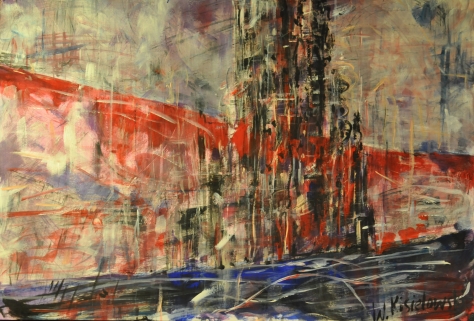
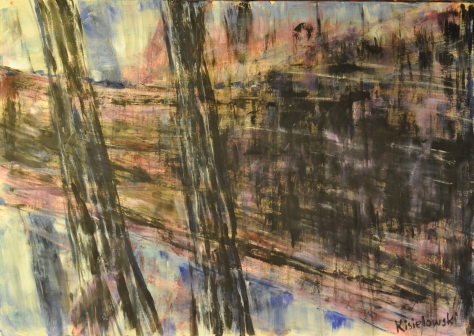
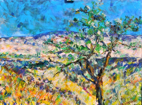
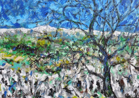
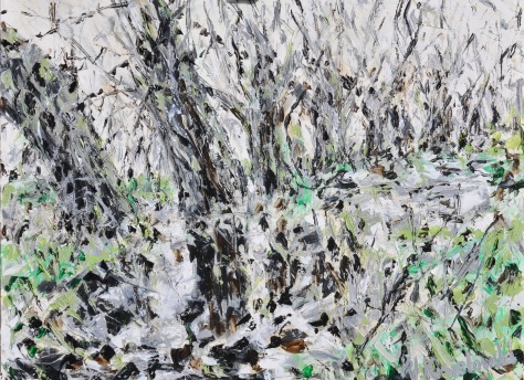
Next I painted the same trees changing the tone of colours, using a traditional way of painting. The biggest challenge while painting this was the branches and bushes as I wanted to show the composition of trees and the rhythm they create and in the colour I wanted to create a oneness with the rest of the painting.

“The Willows 2” Acrylic on canvas 80/60cm

DSC_1404 
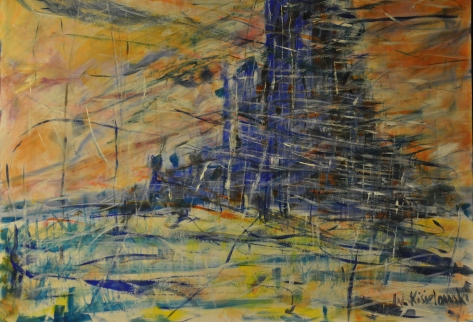
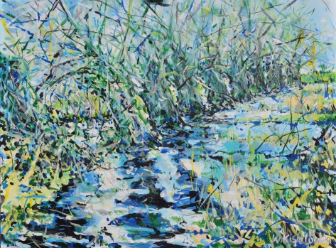
I then went onto something different and change from acrylic to gouache on board and tried a different mood using a completely different palette of colours. For me this was a way to show the same theme but in a more abstract way.

“The Willows 3” Gouache on board 80/60cm

DSC_1423 
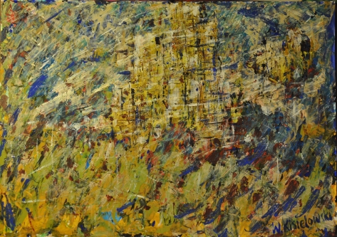
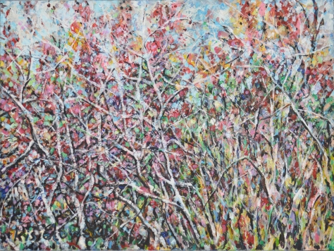
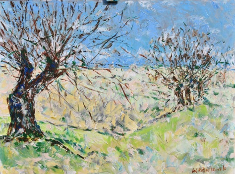
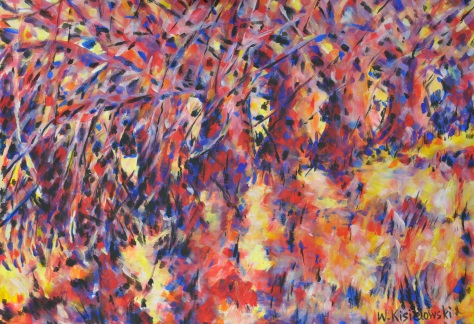
The fourth piece in the series going back to acrylic I wanted to show the structure of the tree itself using darker colours including a lot of black detail. I wanted to get a more realistic form of a landscape, to show the same object in a conventional way and also try to do the same theme in a completely different style.

“The Willows 4” Acrylic on canvas 80/60cm

DSC_1407 
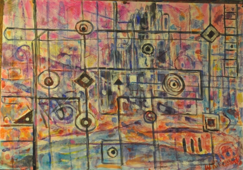
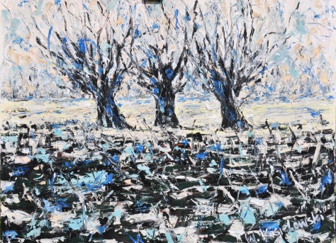
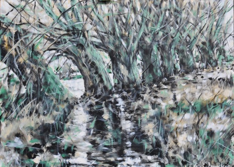
The last picture in the series is a more abstract and expressive form of the theme. While working on this piece after painting the first sketch layer of paint I added some paint brush hair in some areas, gluing it to the canvas using impasto gel, I didn’t wait till the gel dried but started the next layer of paint straight away so the hair still moved under the brush strokes. This was a very interesting experience as this created a barrier for my paintbrush and a natural relief was created which I then covered in paint. In some sense I felt like I didn’t have complete control over what happened but this created an element of randomness which after drying gave me a form of what to paint next, which was to go over the relief and between it. First idea was to recreate the same painting in this but after seeing the effect I decided to minimalize the sharpness of the trees and worked with a paintbrush to show just the branches and the light between them covering the rest of the trees showing them as less important. I would call this an attempt to create an abstraction with a theme suggestion in the background showing that there is something natural in it.

“The Willows 5” Acrylic and Impasto gel on canvas 80/60cm

DSC_1422 
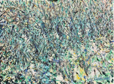
The whole series of paintings has the same theme; I deliberately didn’t copy the same shape of trees because I wanted each painting to be different so I explored each one in a different way.

Work on this project was definitely an evolution of me as a painter and I see similarities such as brush making and creating form and space as I tried to show a personal attachment in each piece. I worked relatively expressively but still managed to leave a personal mark on each work. I am aware that each painting has a different degree but I tried to use different medium and some are more or less skilfully demanding when manipulation it to the painting. I was not able to eliminate some problem during this project I also see problems after some time but unfortunately I do not have time to fix them. During this project I looked at many artists and used the book by Ian Simpson “The Challenge of Landscape Painting” published by Collins but haven’t adopted any of the other artists’ techniques and used my own inspirations to develop.


Part Five: Personal Development

Part Five: Personal Development

Project: Different ways of applying paint

I started the project from impasto using a think paint brush and acrylic paint, I tried to paint placing a thick amount of paint onto the page experimenting how the paint combines with other colours on paper. For this exercise I found an easy composition of fruit and a bouquet of flowers. I tried to not pay attention to detail; I just wanted to create an effect using a thick layer of paint.

DSC_1432

DSC_1431

DSC_1430

Next I decided that to get a good impasto effect I needed to buy some more equipment and got a matt impasto gel for acrylics and a heavy structure gel also for acrylics. I started painting using a painting knife and a rubber scratching pencil alongside a normal brush to create the desired effect. Before I started using every element I needed to decide what to paint and was not going to carry on with still life but try to paint a simple landscape, I chose a few photographs which I could use for the project and after a moment of consideration I came to the conclusion I couldn’t put as much detail into the picture as there was in the photograph. Using impasto gel it was easiest to use the painting knife and this means not putting in as much detail. I didn’t pay too much attention to the kind of landscape I just wanted to try out the technique using the photograph as a stencil. I painted picture with pine trees in the front to give the picture some sense of space with something in the foreground and background.

DSC_1419

Next I decided to change my palette of colours and play with a different landscape with a similar composition featuring a tree in the forefront and hills covered in snow in the background. When I applied mixed gel with acrylic with the knife I also used a paintbrush to go over some detail.

DSC_1409

I next wanted to come back to a painting I have shown earlier and see how I can build a similar picture to one I have done already but using the impasto technique, it was of course simplified and details were missed out so I could use the technique.

DSC_1415

After finishing the painting I decided that the technique is very difficult and I needed to paint a picture where the forefront was simpler and calmer but the concentrate on the details of branches, I always found painting trees a difficulty so this was a little challenge for me. I didn’t want to pay attention to each leaf or branch but I wanted to show an impression that the trees are three dimensional and fit into the space.

DSC_1417

I now continued the tree theme using a painting knife but working more expressively and I also applied paint using a paintbrush dripping and almost throwing it onto the canvas. I had a few layers of paint with impasto gel and used a scratching method for further detail.

DSC_1411

After finishing this picture I started to think about the main project and decided that the technique and process would be useful for the final piece. I used a photograph of willows near a lake, covered in grass and weeds. They are very fascinating trees with large roots coming out the ground and lots of branches. I used a similar pallet of colours to the previous painting and used the same technique.

DSC_1414


Project: Adding other Materials

I prepared two small A3 canvased covering them with toilet paper and pva glue, creating a texture. When I was applying the wet paper I didn’t really think about what I was going to create and when the canvas dried I had a dilemma of what to do with it. I tried to cover it with paint and seeing what it comes out as; I added a little impasto gel to give even more texture. After finishing with light shades I decided to add some bring darker colours. I decided that it resembled a blossoming tree. Next I decided that using heavy structure gel and acrylic I would add rice to the paint. I tried to see how the method could work and paint a abstract looking nightly landscape with a tree in the foreground. The two exercises were interesting and showed that I can add structure, texture and relief to my painting which in turn created a deeper space not using just paint which is expensive. The painting was a typical experiment and also piece of work with many luck accidents as the form of composition was created by the moving rice as it didn’t completely stay in place.

DSC_1427

DSC_1428

The next experiment was the final piece where I added hair from natural hair from brushes.

DSC_1422

Project: Towards Abstraction

I started this project with but wasn’t completely convinced towards as the exercised don’t fit with my nature. I am not a painter who tends towards abstracts. Creating abstract painting is a natural process which lives inside an artist whereas I need to mature towards an abstract painting. I need to find a more natural way of creating abstract paintings. I thought for a long time about what to create and started with a simple form of a tulip and came to the barrier that for it to be abstract it needs to be painted in a different technique to what I paint. I did sketches using water colour and next on canvas I tried to create a water colour effect without having any idea of how to expand it into something abstract, I decided that I could express it as a tulip but some natural plant form. Next I decided that I would take the structure of the flower and paint it using patches and create a relief around it.

DSC_1425DSC_1433 
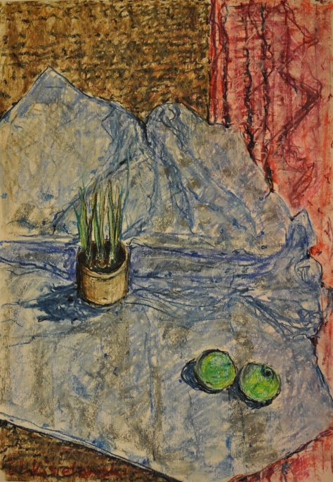
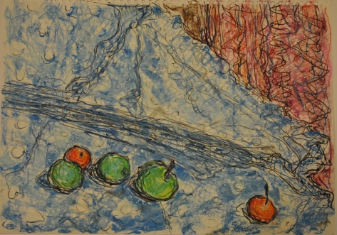
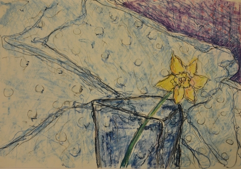
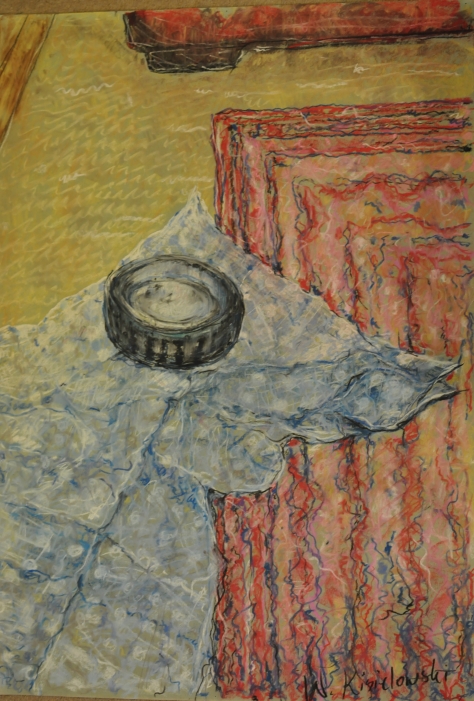
I got the same problem with man-made forms. I chose simple objects like a brush on a table covered with a blue sheet covered in paint marks. I tried to arrange a few simple compositions so that I wasn’t paying attention to the detail of the brushes but to show them as objects in space, this was my only idea of showing an abstract illusion.

I was already working on my final piece at the same time and decided to try showing the willows in a more abstract way using unnatural red and blue colours.

DSC_1423

“The Challenge Of Landscape Painting” by Ian Simpson

This book is a guide to help painters look at landscapes in a new and personal way and translate this into a successful landscape painting. It looks at the challenges faced by those wanting to paint a landscape and why many artists are fascinated by them. The book discusses differences between painting on the spot, using a photograph and painting from memory and each advantage and disadvantage each method has, going in depth into each method. The thing I found most interesting was the illustrated interviews with many artists for example John Piper and Norman Adams. They talk about their experience in a very personal way, teaching us how they solve different issues they face and what they find most fascinating about painting landscapes.

The book isn’t aimed at a certain type of artist as I feel like it offers advice that anyone at any level could find useful and this is why I found myself looking into the book throughout the project. I found it particularly interesting that the book doesn’t specify a certain method of painting but encourages you to try out different things and experiment with what you personally feel is a good idea. This book is good for self development as it shows each artist has its own unique character and that they should follow it.

The book discusses effects of light, weather and composition and different media such as water colour, acrylic and oil. This was very helpful as you could see how different effect can be achieved using different types of paint.

Overall the book was a good resource to have as it showed the works of many artist and how landscape painting is developing. The different approaches showed in the book are helpful for any artist looking for an idea and putting them together allows one to create something unique to them. The book really helped me learn a greater understanding of landscape painting which was useful in this project.

Jackson Pollock

During the course, I looked for abstract artists, especially those who used the style called Tachism or ‘Action Painting’ like Willem de Kooning, Arshile Gorky, Robert Motherwell, Barnett Newman, and Mark Rothko. The most emotional and interesting for me was an American artist, Jackson Pollock

Jackson Pollock was an influential American painter. Jackson Pollock’s greatness lies in developing one of the most radical abstract styles in the history of modern art, detaching line from colour, redefining the categories of drawing and painting, and finding new means to describe pictorial space. He began to forge a new style of semi-abstract totemic compositions, refined through obsessive reworking. By the mid-1940s, Jackson Pollock introduced his famous ‘drip paintings’, which represent one of the most original bodies of work of the century. To produce in Jackson Pollock’s ‘action painting’, most of his canvases were either set on the floor, or laid out against a wall, rather than being fixed to an easel. From there, Jackson Pollock used a style where he would allow the paint to drip from the paint can. Instead of using the traditional paint brush, he would add depth to his images using knives, trowels, or sticks. This form of painting, had similar ties to the Surreal movement, in that it had a direct relation to the artist’s emotions, expression, and mood, and showcased their feeling behind the pieces they designed.

To this day Jackson Pollock is known as a leader in the most important 20th century American art movements just like William Shakespeare on literature, and Sigmund Freud on psychology. He created a new scale, a new definition of surface and touch, a new syntax of relationships among space, pigment, edge, and drawing, displacing hierarchies with an unprecedented and powerful and fabulously intricate self-generating structure.

I used some of his experimental techniques during my exercise. I don’t want to copy his style, but this abstract action painting is very powerful and I think I can use it sometime when I feel more confident in the future.

Image result for Jackson Pollock

One: Number 31 by Jackson Pollock

One: Number 31 by Jackson Pollock

Image result for Jackson Pollock

Hyeyoung Maeng

Hyeyoung Maeng is a South Korean artist who explores the boundaries between painting and film. Her work is a mixture of drawing and painting which she uses to create realistic portraits with a strong cultural influence.   Even though her portraits seem realistic she combines this with abstract backgrounds which use some nature and human form to create an interesting setting for the portrait. She creates series of paintings where the main subject is the same but the background become more obscure and blends into the figure more and more as the series goes along. This creates an interesting view and shows how one figure portrayed in different ways can have completely different emotional effects on someone. Looking at her other work which is not based around a portrait you can also clearly see that she uses mixed media, she is able to combine paint with lines of drawing to create something spectacular, unusual to look at and interesting. Overall her work is very contemporary with many different influences, some cultural and some taken from different techniques, she uses all this to create her own pieces that really speak and stand out, combining slightly abstract ideas with realistic ideas to create emotion and feeling. We can learn from her how to develop and continue one piece of work with different approaches and effects to create similar yet different pieces.

 Sandys  (Bunche on Korean paper, 24″ x 28,” 2015)