PART FOUR- LANDSCAPE ELEMENTS
PROJECT 1- LINEAR PERSPECTIVE
EXERCISE: DISTANCE- PREPARATORY DRAWINGS
I started this exercise with going to Holy Island on a trip taking my equipment with me, when there I drew some pictures that showed distance and perspective. The pictures had a clear horizon line. I wanted to paint but only used felt tips and did the drawing from inside my car as it was too windy. I had the idea of then diluting the felt tips with water, creating more colours and gave me the impression of what the colours would look like if I later chose to do the pictures in water colour.


EXERCISE: DISTANCE- LINEAR PERSPECTIVE DRAWING AND PAINTING
I started this exercise by painting the view from my window due to the weather conditions but the view showed too many things and the distance was not clear, I just saw a valley without sky or the horizontal line. So I experimented and tried to show more perspective adding darker elements in the foreground using chalk, this gave me the impression of distance as the darker objects appear closer than the lighter ones. Next I used a photo which I took while on Holy Island which shows very clear perspective and painted a picture of this, the pilgrims posts helped greatly with showing perspective.


PREOJECT 2- ARIAL PERSPECTIVE
EXERCISE: AERIAL PERSPECTIVE URBAN LANDSCAPE-PAINTING
For this exercise I chose to paint from a photo as I live in the country and did not have a chance to go to a more urban area. I painted Clifford’s Tower in York.


EXERCISE: AERIAL PERSPECTIVE IN RURAL LANDSCAPE
In the region I live in there is a lot of places where there is a lot of nature, rocks and small hills, so doing this exercise I did three paintings choosing places where there are rocks and cliffs as that is one of the topics I will be looking at later. Next I did a painting from a photograph of a lake in the Lake District, the inspiration for this was the painting “Dolbadarn Castle” by Samuel Jackson which shows perspective in a brilliant way.


PROJECT 3- PAINTING SKY
EXCERICE: TONALLY GRADED WASH AND SIMPLE CLOUDS AND DIFFERENT KINDS OF CLOUDS
I observed the sky and the first difficulty was how to paint clouds so I decided to first do a small sample painting on dry paper and then a second on wet paper and compared which looked better, my conclusion was that I needed to work on wet paper. I did a third bigger painting remembering the clouds I saw as they kept changing but also experimenting at the same time. I then observed the sky later on and did a painting where the form of the clouds was different. I decided to then find greyer cold colour and attempted to paint them. Doing this exercise I tried lots of different things and experimented dampening the page and using a sponge to create effects. The difficulty with this was that the sky was taken out of context and I wasn’t sure if I was true and I might have changed things to give the paintings a better effect.


EXERCISE: SKY DOMINATED LANDSCAPE
I found including a landscape with the sky much easier to paint. My first work I wanted to give the effect of cloudy hills. Next I painted a picture looking down from a hill onto foggy moors with the fog blending in with the sky. I then painted a sunset where the sky was being reflected in puddles of water. The next painting shows sky with just a dark outline of the horizon. The last two paintings show sky at the sea side with two different weather conditions, one with dark dramatic sky the other with a calm more warm sky.


PROJECT 4- PAINTING WATER
ECERCISE: STILL LIFE WITH WATER
I did two paintings for this exercise where fruit was placed in a glass bowl filled with water. I had a problem with the glass bowl as it was very reflective and it can’t be hidden that the reflections changed the colour of the water and so the banana and apple looked different surrounded by water.


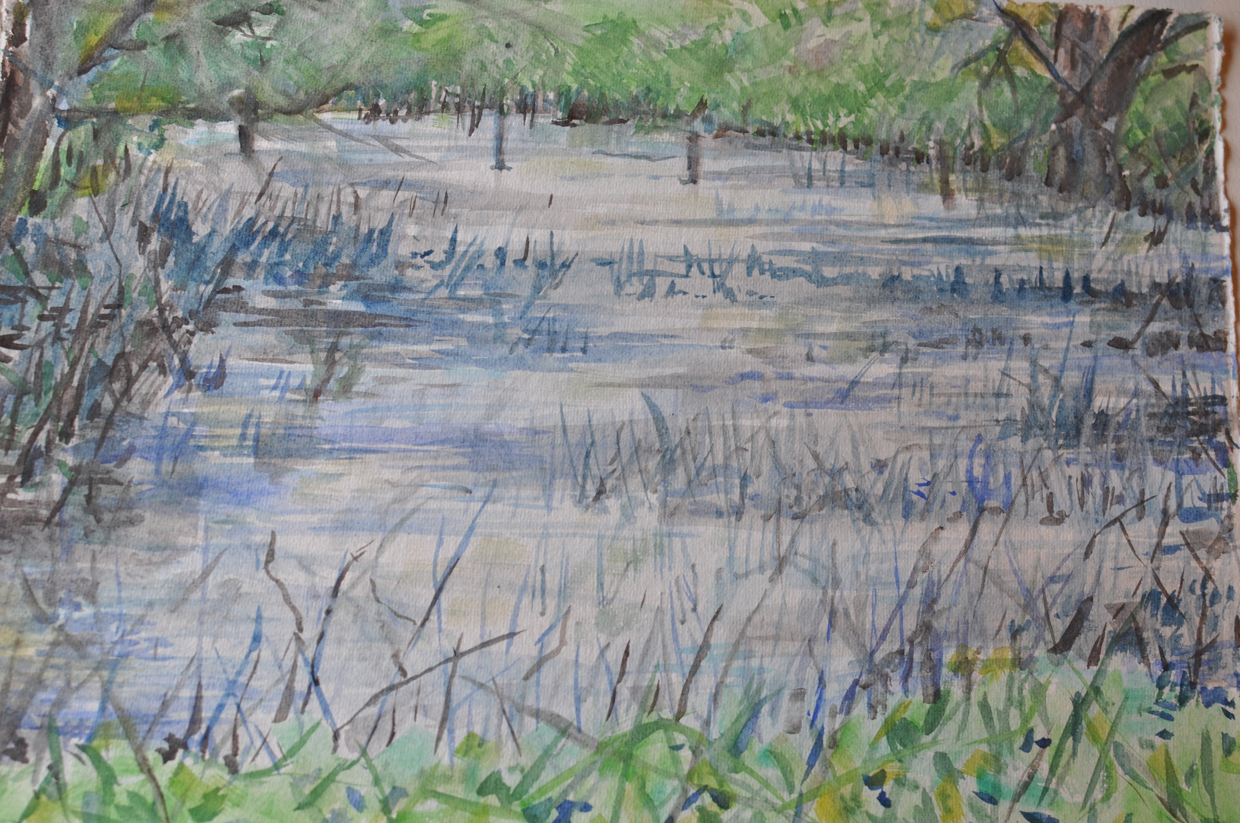
EXCERSISE: PAINTING STILL AND DISTURBED WATER
In the first three paintings I tried painting a small stream where the water reflected the colours of the surrounding greenery and soil where only in some moments you could see light reflections that looked more like water. Next I painted a pond which had the reflection of trees and plants surrounding it but everything kept changing very quickly so I am not sure I portrayed the effect of water clearly. The first tried where done from a very close distance and show close ups of water, on a later day I returned and painted the pond from a different perspective showing the water in a context.


EXERCISE: PAINTING MOVING WATER
I first did one small try showing moving rain water which appeared brown and dirty. Next I went to the river and did a painting of foaming water trying out some new techniques and then I did a bigger painting showing more of the river and in some context.


PROJECT 5- PICTORIAL INTREST
EXERCISE: PAINTING TREES
It is very difficult to paint a tree because I always have a problem with the branches, I try painting the trees showing natural shape but also not making the branches looks too sharp. I found a lovely autumn atmosphere painting trees and in the second painting I also decided to include water. I tried to make sure the trees were included and clear in the landscape but not over powering or in the foreground which to me looks more natural. I have the impression that the two paintings are a way of showing trees in the background in future paintings.


EXERCISE: PAINTING ROCKS
First I found a place where there were plenty of rocks and I did two paintings but I don’t think the composition was the best as it was too concentrated on the rocks and the composition seems too heavy. This lead me to paint some rocks from the distance but the light was not too good and there wasn’t much contrast on the rocks. On another day I tried to paint different kinds of rock with a more orange tone and then I painted some gravel in water. Finally I painted some rocks from a photograph where the contrast was strong due to the light shining on the rocks from one side, this photograph also had a very interesting background.


EXERCISE: ANIMALS AND HUMAN FIGURES IN THE LANDSCAPE
I made quick sketches of cows in the field and worked very fast as they were all moving and I am not sure if I have drawn the proportions right but I wanted to create an impression and capture them in a given moment. For the human figures I did a quick sketch of a farmer in a field. For the final painting I used a photograph from my holiday which showed an interesting scene of my family on a rocky beach giving me another chance to practice painting rocks and water in the background. I did not do a very good study of the human figure but rather showed the contrast between the colours of the skin and the colour of the rocks the figures are on, I think it is an interesting show of colours and if I have more time I will come back to this concept and try to do this painting more precisely. The first painting with the farmer, in my opinion, show a better connection with the landscape but the second shows clear contrast but I have the impression that the unusual choice of colours can also be very interesting.