Category Archives: Coursework – Drawing Skills

Part Four. The Figure and the Face


Project 1: Fabric and Form

Exercise 1 Drawing fabric using line and tone and Exercise 2 Emphasising form with cloth

In this exercise I tried to analyse a fragment of fabric on the side of the armchair, I used tone and line and for some both together to show this. Some of the sketches represent a fragment of fabric as I focused on one part of this fabric and tried to analyse how all the folds and creases look and how you can achieve that affect using different techniques, I tried to show the structure of the fabric. I came to the conclusion that on a small piece of fabric to showing structure using charcoal looked more stable than doing a line drawing using pencil or felt tip which allowed me to give the fabric more dynamics, these observations were used in the next exercise where some drawings are more stable and focus more on light and atmosphere and some using sharp lines help build the figure of the model in a more dynamic way. The model in the loose fabric was hard to draw as the figure of the model was distorted by the fabric, this made the whole exercise harder. I knew about this and so I concentrated on the fact that my model was wearing loose clothing and in a quick way define the loose fabric

DSC_0879 DSC_0877 DSC_0878 DSC_0880

DSC_0881 DSC_0883 DSC_0882 DSC_0885 DSC_0884 DSC_0889 DSC_0888 DSC_0887 DSC_0890 DSC_0891


Project 2 Proportion

Exercise 1 Quick studies and Exercise 2 Longer studies

This exercise was a continuation of work from the previous exercise. In this exercise I sat my model down and I did quick sketches changing my position. I used felt pen. From the first drawing I noticed that because the seat was soft the bottom of my model was hidden, this distorted the shape slightly. I tried to do the sketches quickly and so they appeared lively, I did not pay much attention to detail. For the longer study I did a drawing on a larger format of the same model with the only difference being the model was now sitting on the sofa. I also joined a live model class and started working with a nude model.  So I did a few quick sketches and longer studies at this class.

DSC_0892 DSC_0893 DSC_0895 DSC_0894 DSC_0927

DSC_0935 DSC_0933 DSC_0930DSC_0170 DSC_0169

Project 3 Form

For these exercises I did work at home as well as using the opportunity at a live drawing class where I could take lots of observations of the human form and define the proportions and shape as well as observing the human figure from different angles where complications are formed as some elements are in a space that makes it difficult to portray them on paper.

In my sketch book I did a many drawing where I arranged my model in different positions and tried to build proportions in a quick way. In all theses I tried to focus on basic shapes, essential elements and stance of the human body. I came to the conclusion that the difficulty in showing the model on paper depends on my angle, position and distance from the model. It is much easier to show the model from further away which makes it easier to figure out proportions of the model with respect to itself, it is much harder to draw a model close up where I am closer or above the model and the proportions then change and I had to think harder about perspective and how the human body is placed in the space, some of my sketches I did not think about all this and just tried to create something without thinking and then looking back at some of them especially the nudes of a woman they took on a more intimate character but after deeper analysis I came to the conclusions that it is very important to look at the proportions and construction of the model.

DSC_0962 DSC_0961 DSC_0960DSC_0959 DSC_0958 DSC_0957

DSC_0929 DSC_0934 DSC_0928 DSC_0933 DSC_0932 DSC_0179 DSC_0178 DSC_0177 DSC_0176 DSC_0175 DSC_0174 DSC_0173 DSC_0172 DSC_0171 DSC_0168 DSC_0167 DSC_0166 DSC_0165 DSC_0164 DSC_0163


Exercise 4 Energy

For this exercise I didn’t have many ideas of how to show energy so I looked at photographs of ballet dancers and show them in a quick and easy way, the poses themselves would be hard to do for my model so I just used the pictures. I will write about this more with the moving figures.

Project 4 Structure

Exercise 1 Structure of the Human Body

For this exercise I did a few sketches for example of my hands or asking my model to lie down and focused on for example the knees or bottom taking just parts of my models and drawing that fragment.

DSC_0915 DSC_0916

Exercise 2 Three Figure Drawing

I at first did quick sketches with the model in a sitting position, lying on the sofa and stood up. The seated and lying down studies I will show in my final project as I used these sketches for my final piece.

DSC_0918 DSC_0917

DSC_0924 DSC_0921

DSC_0920 DSC_0922 DSC_0923

DSC_0950 DSC_0941

Project 5 Moving Figures

Moving figures were a natural continuation of the Energy exercise; I did a few sketches of groups of figures as well as single figures. I tried to draw really quickly and not focus too much on all the detail in the photograph; I tried to show energy and movement in my sketches. I didn’t focus too much on proportion, for example in the picture of a ballerina doing the splits I multiplied my lines and I repeated the body shape multiple times to show the effect of movement and energy of the figure. My first picture showing a pair of dancers looked too stable and you couldn’t really see movement in it and so I added vertical lines to try to show some movement around the pair, especially in this picture you can see that the legs of the dancers are in a position that isn’t moving so it doesn’t really show energy in itself.

DSC_0913 DSC_0911

DSC_0910 DSC_0912 DSC_0914DSC_0926


Project 6 The face

Before I started the exercises I picked different pictures of random faces and drew different parts of the face for example the nose or lips. I did this without thinking about what the photo looked like just picking at random. After this I picked faces and drew the whole face, all faces have different character and shape; I tried to define the features of the face quickly. Next I started drawing self-portraits, I did this using different techniques. I tried to portray my face, know to me, in a way that showed the face differently in each picture but also made the picture more interesting. Next I did two portraits from memory, the first was a picture of an old bearded man who I used to see this was done in felt pen, and the second was a drawing of a woman using pastels. In the portrait of the woman I tried to show the face in enface and profile at the same time and this is why the nose, which is the first thing you notice, is showed from the profile, the woman isn’t looking straight and the forehead shows that the woman is slightly tilted but when you look at the face as a whole it is central. There is some influence of Modigliani in the picture, I had his work in mind while doing this picture from memory but I wanted to avoid the similarities so I drew a fuller face.

DSC_0896 DSC_0901 DSC_0897 DSC_0898 DSC_0900DSC_0908

DSC_0905 DSC_0903 DSC_0904 DSC_0906 DSC_0907

DSC_0902 DSC_0909

PART THREE OUTDOORS

PROJECT 1: TREES

EXERCISE 1: SKETCHING INDIVIDUAL TREES

I started this exercise by drawing an apple tree from my garden, looking through my kitchen window. You can see that the viewpoint is from a height because i am looking down at it, from my house. Then I moved to a different window, where i saw a huge light contrast on my Cupressus tree. You could not see the branches, just the needles. I only concentrated on how the light built the shape of the tree. I realised that i should’ve put more dark in the darkest areas, but i could not achieve that with the pencil i was using. I then did a slightly bent over pine tree. This pine tree was quite far away from my window but it intrigued me because of the shape.

DSC_9848

DSC_9850

DSC_9852


EXERCISE 2: LARGER OBSERVATIONAL STUDY OF AN INDIVIDUAL TREE

My first study was with charcoal. I was sat at the edge of a cliff, where a tree was growing from the bottom. I drew what i could see straight on with my viewfinder. The next one a big tree growing on a field. I did not show a lot of detail, however, the tree altogether had a nice atmosphere and a lot of branches tangled in each other. It had something to it that made me unable to concentrate on the details too much. Then i did a pencil drawing of another old tree. The light was very bright, and covered most of the tree so there was not much shadow, so it was harder to show the form in 3-dimension. The next sketch is a fragment of a tree, and it was in a more contrasting light in more detail. It was easier to present in the space.

DSC_9853

DSC_9855

DSC_9857

DSC_9859

EXERCISE 3: STUDY OF SEVERAL TREES

I changed my medium to felt tip coloured pens to practice different mediums. I started drawing several trees, with a huge old tree on the first plain. I tried to build the shape of a tree using a high contrast. I added some yellow to the parts of the trees that had the most light covering them. I also tried to show that there are trees in the background but less important. Then i drew another several trees from the distance. In that space there were a lot of pine trees mingling with other types of trees. I tried the same view, with the pine trees only with a big tree in the front, using pastels. I should do more detail on the front tree because the branches do not stand out from the trees in the background. Next i did a pathway between the trees trying to show perspective. I had a problem as that pen ran out, so couldn’t add more black to the drawing. The right side of the drawing was in shadow more than the left, so i should’ve added more black to that side.

DSC_9861

DSC_9862

DSC_9863

DSC_9864

PROJECT 2: LANDSCAPE

EXERCISE 1 CLOUD FORMATIONS AND TONE

I couldn’t do that exercise properly as it was always bad weather, or when i came home from work it was dark so i tried to catch some clouds from the window and i did one drawing in charcoal of storm clouds where the clouds were very dark but you could see the sun shining through in some parts. In the next drawing i tried to draw the sun shining through in a 3b pencil. I then did some different formation of clouds using a pencil. This is a combination of clouds that travel very fast in the sky towards my direction so we can see the big clouds over our heads but the small ones are travelling in our direction from a distance. I should add some landscape context to that drawing to show that cloud in bigger perspective.

DSC_9865

DSC_9866

DSC_9867

EXERCISE 3: 360 DEGREES STUDIES

I did three drawings concentrating on trees, changing the viewpoint  and observe how the setting of the tree changes. So i have completely different viewpoint of background but the same tree in the middle and i know now, using the different viewpoints, how to make the drawing more dynamic. The viewpoint was changed only slightly but each drawing is different because of this.

DSC_9868

DSC_9869

DSC_9870

PROJECT 3: COMPOSITION

EXERCISE 1: DEVELOPING YOUR STUDIES

For this exercise i used soft pastel on sugar paper and i tried to add to my previous drawings by adding more detail and colour. Overall i think for a detailed study this medium was not appropriate. I only added some colour to previous drawings. I thought i could concentrate on detail but this medium was not letting me be precise. I caught some light on the branch and on the tree and the fence but that was all that i achieved.

DSC_9877

EXERCISE 2: FOREGROUND, MIDDLEGROUND AND BACKGROUND

For this exercise i chose the same landscape as the previous exercise but i came closer to the trees. So i did the first tree on the first plain with more detail, another one with less attention and a third tree with much less attention. I tried to achieve perspective in that landscape. I live in a hillside area so there is not much sky in the background, just hills. I think you can clearly see the foreground, middleground and background in my work.

DSC_9874

PROJECT 4: PERSPECTIVE

EXERCISE PARALLEL AND ANGULAR PERSPECTIVE

For this exercise, i went to Jervaulx Abbey because i thought it was a good place to look for some perspective in the ruins and I did some sketches using pen. For some of those sketches i tried to define the distance using a bold mark, and the far end i would use gentle lines. I had to draw quickly because the light was changing fast and all these elements looked different every minute. Next i did two drawings of the gallop track where the fence turned. I find looking through the perspective view interesting .

DSC_9879

DSC_9880

DSC_9881

DSC_9882

DSC_9883

DSC_9884

DSC_9885

DSC_9886

DSC_9887

DSC_9888

EXERCISE 3: AERIAL OR ATMOSPHERIC PERSPECTIVE

The first drawing was of the ruins near me and then I did some charcoal drawings looking around the estate where i live. I concentrated more on the tonal valuation than the line drawing.

Next i did an old railway track which was interesting because the railway tracks illuminated with light and gave an perspective of massive distance when they disappear.

DSC_9889

DSC_9890

DSC_9891

DSC_9892

DSC_9871

PROJECT 5 TOWNSCAPES

EXERCISE 1: SKETCHBOOK OF TOWNSCAPE DRAWINGS

I am not happy with that part of this project because doing this i needed to use some old photos to complete this exercise as i work very late and live in a deep countryside therefore i cannot get to a town quickly. I used photos from my Whitby trip and i selected some interesting places. Another thing i wasn’t confident with was doing the 10×10 cm drawings. I did a couple of these drawings and cropped some interesting objects from my my photo,but to be honest i am not happy because I had to draw from the computer screen not from what i could see directly.

DSC_9899

DSC_9895

DSC_9894

DSC_9893

EXERCISE 2: STUDY OF TOWNSCAPE USING LINE

For this exercise i found an interesting backstreet where a lot of barrels from the beer stood and the whole street was interesting because it looked very unkempt and it had plenty of dramatic effect with the guttering pipes sticking out from the buildings. I did two drawings using pen and the final drawing was using ink with bamboo stick. I wanted to use a nib but i found out that it was broken so i couldn’t use it. I made a lot of mistakes and couldn’t draw very precisely using the pen. In the end i watered down the ink by painting over the drawing with water.

DSC_9898

DSC_9897

DSC_9873

EXERCISE 3: A LIMITED PALETTE STUDY

For this exercise I used my Whitby photos again. I did my first drawing in charcoal. At first it was meant to be a primary sketch for colour but i ended up finishing it in black and white. I wasn’t happy with the composition so i changed to portrait view and i used only 3 colours on grey paper. The most important thing i wanted to show in this picture was show the lightest places, like the white block on the building. I found that part of the drawing very interesting.

DSC_9872

DSC_9896

EXERCISE 4: STATUES

For this exercise I had a big problem with finding a statue so i drew some chimneys. The three chimneys looked like statues on the block. Next I found a cross on the church roof This drawing is not perfect because i looked at the cross from quite a distance. i was looking in the direction of the sun and i didn’t see any elements other than the outline. Sometimes the light changed for a few seconds and I thought I saw some different dimension but everything moved too fast with the light so it was difficult to catch the moment. I tried to catch it with a soft pencil. Next i went to a cemetery and i drew what i saw. The difficulty was that some stone was very wet and therefore looked darker and others were dark because of the shadow so they had the same shade.

DSC_9900

DSC_9901

DSC_9903

John Virtue

John Virtue

John Virtue is a landscape painter who mostly paints black and white acrylic painting where he joins line drawing with abstract elements.

His work is mostly done on canvas and I am familiar with some of his work featuring urban architecture and sea side scenes. My first impressions were that the works were done in chalk or charcoal but they are paintings. The artist uses his own language to show expression his work is dynamic and appear to be moving, you cannot concentrate on individual elements we can only see the painting as a whole. We see constant movement in the town, sea and sky.  The perspective and proportions are visible but are not clear, the buildings are often hidden in the darkness or clouds but then appear again sometimes moved or transformed but this does not bother us. Looking at his work I had a significant but unexplained feeling and I had a feeling that everything important in this course was not significant but that you can find them later in a different shattered meaning.

Landscape No 710, 2003-4, by John Virtue

http://www.independent.co.uk/arts-entertainment/art/great-works/great-works-landscape-no-710-20034-by-john-virtue-8485446.html

John Virtue. The Sea

http://wsimag.com/art/12166-john-virtue-the-sea

Tacita Dean and George Seurat

Tacita Dean and George Seurat

I would like to compare these two artists and show different approaches in landscape.  Comparing the work of Tacita ‘Fatigues’ to the work of Seurat ‘Landscape with Houses’ can be very hard as we are comparing the works of a modern artist, who uses photography and a modern approach to her work, with the works of an artist who used a different medium in a different time period.  The work ‘Fatigues’ which was done in chalk on blackboard has excellent depth and in a way reminds us of a good black and white photo. The drawing is a panoramic format where the mountains are central and bound by the black frame of the background and this distinguishes it from a photograph where we normally have a composition that is open. Here the artist has picked the most interesting elements and has given the piece a very dramatic feel through the right selection and composition.

Seurat used conte crayon which is a completely different medium in with which lines are softer and it is harder to achieve shadow. In his work we have to look for shapes, it is hard to define the different elements and the vanishing point disappears softly. In his works we do not have a distinguishing factor between foreground, middle ground and background. The exact proportions shown in his works help us find a perspective even if it is not clear at first. His work is very dark and without tonal evaluation, they have a nostalgic character which gives us delicate and poetic feelings not like in Tacita’s works which are more dynamic and expressive.

You cannot see any connection between the two artists but they can both focus the view on the most important part of the drawing and evoke emotions.  For example George Seurat in his work ‘Landscape’ focused our attention using conte crayon showed perspective and focusing our attention to the telegraphic poles without using too much detail and lines. On the other hand in the work of Tacita shows great depth in itself and we can see great distance. This is an example of a work where the artist has not included a foreground and has done this on purpose and well as this is a sort of manipulation where the artist has avoided the inclusion of the foot of the mountains and thanks to this the work looks very impressive.

Albrecht Dürer

Albrecht Dürer

German artist during the renaissance (1471-1528). An artist which has some sentimental value to me as when I was 15, so a long time ago, I had a chance to see Durer’s work at an exhibition in National Gallery in Krakow it was the year 1988. In a period of time in Poland in which there only existed two television channels, there where there were not many colour editions of albums and there wasn’t internet the society was very interested in any larger cultural events. So I also was interested in seeing this exhibition and after seeing his work I started drawing and decided to go to art collage. This is why it will be a great pleasure to write this short essay.

Albrecht Durer came from Nuremberg in Germany but after traveling you can say that he inherited Italian style especially Venetian mixed with original Northern European, this style had a large influence on art. The artist was versatile and did paintings and graphic work in which he showed animals, people and landscapes. In landscapes everything fascinated him, not only did the whole picture had a meaning but the little details such as plants, animals and anything out of the ordinary. His work has a lot of symbolism I am mostly fascinated by his apocalyptic views, the emotion in these works with conjunction to intricate drawing, he used expressive line and showed the smallest details but yet he still managed to link everything with the norm for renascence art such as soft detail of faces and add ancient architecture and show its perspective with every visual effect. Durer very often showed elements of the New Testament where the people were portrayed in scenes containing architecture modern to that period which to the perspective of the viewer special meaning.

In his watercolour works he was able to show in great detail different kinds of herbs, shapes of leafs, small branches and many shades of green. While looking at his work you could say that he drew every individual bit of grass with great detail. With every little detail he created a great composition. Such observational skills require a great deal of patience. In the times of renaissance artists did lots of sketches from nature as sketching things from nature such as animals and plants they were than able to use these in later works. In our times we can document nature using photographs but is it the same?

The study of landscapes done in a very realistic way was mostly backgrounds for a religious scene but they were also very time consuming and were also very important like the rest of the elements. Durer was always precise to create the perfect painting; his attention to detail is a great example to show during this course. He used the rules of Vitruvius when looking at proportions and the rules of Seneca while looking at composition which said to look at the most interesting objects and people to create a masterpiece.

In conclusion at the stage of this course I can say that the artist was excellent at observing nature, he knew how to use perspective to create effect and knew how to get proportions right. For me the artist will always remind me of his series of Apocalypse work s where the artist was able to show things like fire, lightning, thunder clouds and also show emotion and even what people are thinking and saying.

The Knight  Death And The Devil - Albrecht Durer - www.albrecht-durer.org

The Knight Death And The Devil

Great Piece of Turf - Albrecht Durer - www.albrecht-durer.org

Great Piece of Turf

View of Arco - Albrecht Durer - www.albrecht-durer.org

View of Arco

Research point- The Nabis and Decorative Interior Painting

I will be writing about a group of artists in whose paintings were mostly interior design. The group nabis was made up of:  Pierre Bonnard, Edouard Vuillard, Felix Vallotton, Ker-Xavier Roussel, Maurice Denis, Paul Sérusier. This  group professed a desire to transform and integrate art into everyday private surrounding. This type of art was very decorative and they redefined the domestic interior as an aesthetic space, added a mystical element to all of interiority. Their work is close to symbolism and they used geometry, lines and colour in the images. All of those artists payed special attention to the design of the interior for example the pattern of wall paper and textiles inside the room, everything was done in pastel colours far from academic painting. Often figures and objects are portrayed as flat but are still shown in space using light and dark colour to crate shadows and lights. The overall effect is highly designed and has a decorative scene. There is no real distinction between figures and object in the space. For example in the painting by Bonnard ‘Nude in the Bath’ all the body of woman is covered in colour with the fluid in the bath contrasting only slightly with the woman and the rest of the painting.

Both Bonnard and Vuillard could both transform an ordinary space into a mystic world. The beauty of these paintings is the use of blotches of colour which sometimes make it impossible to make sense of the space but are definitely interesting and give a different view to the composition of the interior. From this we can learn how to make a connection between people, objects and the closed space itself.  The composition doesn’t always have to be central as we can see the interior from many angles but at the same time every object can grab our attention even if it is not in the central composition. The composition shows the whole interior but also all the details at the same time which allows us to see the whole space at once.  For example the interior scene with ‘woman in bath’ has some kind of an eroticism element similar to Paul Gauguin ‘Aha Oe Feii’ where the blotches of colour and the whole composition of space doesn’t force us to see in a nude erotic but is objectified and this allows us to see the painting as a whole. This type of painting will be useful for anyone wanting to do interior scenes.

  “Nude in the Bath ” (1936) Bonnard
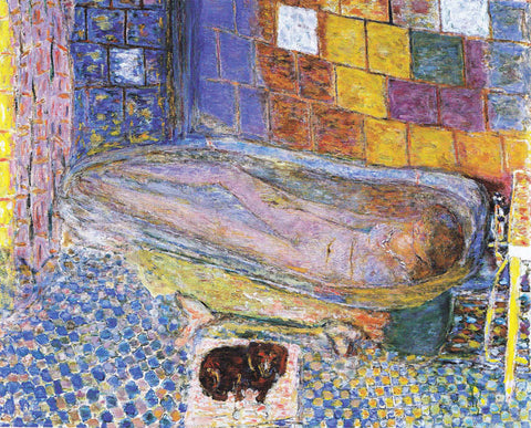
 “Nude in the Bath and Small Dog” (1941-6) Bonnard

http://arthistorynewsreport.blogspot.co.uk/2013/06/pierre-bonnard-at-museum-of-modern-art.html

Edouard Vuillard. Studio or The Suitor/L'Atelier ou Le Prétendant.

Eduard Vuillard ” The Suitor” (1893)

Research point- Animal studies

In this research point I was asked to look for contemporary artists who included animals in their work. The first artist who I found was Albrecht Durer the greatest German artist in the early 16th century. He used oil painting, print and watercolour for depicting subjects from nature- animal, plants and other. He was great but too realistic for me and I don’t really see myself influenced by him apart from his great technique. I started to look at work by Paula Rego who often uses mixed techniques for example collage and painting. She often portrays her work in a childish, fetishist and traumatic way. Her work is like illustration and figurative and reminds me of work by Egon Schiele, George Grosz, Lucian Freud and drawings and books by Bruno Schulz with one difference which is that her work shows a strong feminine side in which the woman is full control of herself and sexuality. She often uses animals in her drawings to portray humans and situations, the animals appear in human form and character. An example of this is the series ‘dog woman’ which is a series of pastel drawings in which she portrays women in poses similar to those of dogs, woman howling, woman on all fours. These drawing are grotesque and very illustrational and the narration is typical of illustrations used in books but this allows her to show social issues. I think that her work is a more helpful influence for me as this sort of work will help me with composition, giving narration of the work and giving a different meaning to animals. In her work animals have their own personality and characteristics which can also show human emotions and feeling this is very important as it is doesn’t just show a perfect copy of the animal but gives the animal something with more depth.

Dog Woman

Paula Rego “Dog Women” 1952

http://www.casadashistoriaspaularego.com/en/collection/drawings.aspx

Dog Woman

Paula Rego ” Dog Woman” 1994

http://www.saatchigallery.com/artists/paula_rego.htm


Research point- Positive and negative space

This article is a continuation of the previous one as it is also about still life but is about how positive and negative space is used in the composition. The first example which came to me was Picassos painting ‘guernica’ but this painting is a figurative composition. I want to show more still life like I said earlier. From the time of the renaissance still life has changed and is free from any cannons. The artist is free to create and experiment using any methods. He can experiment using space and different shapes or concentrate on the different kinds of light. An example of this sort of artist is Georges Braque.

Braque’s Studio painting, some of the most glorious work of the 20th century, with the relationship between form and space in his work the negative and positive space suggests depth and movement and at the same time we can analyse all of the objects. In these cubist canvases we can see oscillation between depth and flatness, shadow and form. Negative and positive reserved space are both opaque’s and transparent. In all this work I can see real connection to the work of Pablo Picasso’s work, especially in ‘Papier colle’ which was one of cubism’s greatest innovations. This technique provided a starting point for Dada, Surrealism and Constructionism.

In ‘Bottle, Glass of Violin’ Picasso has included a remarkable amount of negative space in the composition. In both the works of Picasso and Braque negative and positive space plays a vital role. These types of work really interest our imagination and demand our reflection.

  Georges Braque (Studio 8)

http://ineedartandcoffee.blogspot.co.uk/2012/01/magic-studio-george-braques-atelier.html

 “Bottle, Glass of Violin’”Picasso

http://www.thenewsgallery.com/2011/02/picasso-plays-his-cubist-guitars-at.html

Research point- Dutch Still Life

Research point- Dutch Still Life

Dutch painting played a vital role in the history of art. It is characterised by realism which is very developed not only in still life but also in portraits, natural scenes and landscapes. In the middle of the 17th century in workshops of Dutch artists the term ‘stilleben’ from the French ‘nature morte’ which means still life today. Originally the term meant quiet life. This term has something sombre in it. Typical compositions of still objects were bouquets of flowers or a set table which included crystal ware, fruits and sea food. The specialist of painting flowers in that era was Yan Van Huysum. His bouquets were very delicate and fresh, often with butterflies among the flowers. Still life showing tables were limited to showing half eaten food and drink for example a glass half filled with wine, sliced of lemon, a glass that has been knocked over or a lobster that has been started. If we knew about the cuisine from that era we would know if the painting is portraying dinner, dessert or breakfast. Everything is shown with a great balance of colour and light and in my opinion the whole composition is meant to play with our 5 senses, we feel the texture, taste, temperature of the food. The artists who represented this sort of painting were Willem Claesz Heda, Peter Claesz and Yan Van Kalfe. All of these characteristics have evolved and hare still seen in modern painting. The only difference being that still life has evolved from just being a typical table on a dark or grey background to a more open space for example the works of Paul Cezanes ” Still Life with Apples and Oranges” where we see a whole different perspective and a different study of colour and form, with the objects appearing very three dimensional even though the shadows are not realistic. The composition is strong and geometric. For example the apples and oranges have a spherical shape. The works of Cezanes are the middle ground between the works of 19th century impressionism and post impressionism and the innovative ways of painting which were represented later in cubism for example in the work of Pablo Picasso.  

Still LifeWillem Claesz Heda “Still Life”

http://www.bbc.co.uk/arts/yourpaintings/paintings/still-life-196898

Paul Cézanne. Still Life with Apples and Oranges. Paul Cezanne “Apples and Oranges” 1899

PART TWO YOUR OWN ENVIRONMENT

Project 1 COMPOSITION

Exercise 1 Compositional sketches of man- made objects

For this exercise I used charcoal and later I changed the medium to a soft pencil. I worked on A3 format. I chose a loaf of bread, wrapped in transparent paper, with a bread knife, on the cutting board. With every sketch I changed the position of the bread and I also pulled out the bread from the paper. I used natural light, so with every sketch the lighting changed. After that exercise, I understood that I made a mistake because I changed the position of the bread but not myself, and that would have allowed me to have a completely different point of view. It would be better if I changed more in each drawing. However, you can notice the shadow is slightly different in each drawing.

DSC_9094  DSC_9095       DSC_9096

DSC_9097  DSC_9098      DSC_9099

Exercise 2 Compositional studies of natural objects

I found an interesting place near my fireplace, and the fire tools caught my attention. I used charcoal on A3 format paper. Charcoal and fire tools are an interesting combination. This time I changed both my own position and the items. Each time I used slightly different mark making. If you compare all four drawings, I did not pay much attention to the proportion of each individual object.

DSC_9101 DSC_9102 DSC_9103 DSC_9104

Project 2: PHYSICAL AND VISUAL TEXTURE

Exercise 1: Experimenting

Using pencil and pen, I drew four different objects with different textures. I drew a kitchen sponge, a block of wood, a pineapple and a slice of bread. Later, on another drawing I tried to draw a fragment of fur scarf. I did that drawing just for experimentation because I wanted to try to make the illusion of fur. I am not happy with that drawing at all. Later I did a composition of items. It is difficult for me to tell what the drawing is off as I did a frottage of random items. There is money, kitchen tools and a matches box. I used normal pencil and charcoal to make a difference between mediums and make a more contrasting composition.

DSC_9105 DSC_9106 

DSC_9152

PROJECT 3: DETAILED OBSERVATION OF NATURAL OBJECTS

Exercise 1: Using marker or dip pen

For this exercise I did a couple drawings using felt tips. I do not have much practice with using felt tips. I just use that exercise to be familiar with that medium.  In each drawing you can see how I tried to do different marks; thin and thick lines.  Thanks to that, each drawing is individual.

DSC_9107

DSC_9111 

DSC_9109 DSC_9110  DSC_9108

Exercise 2: Detail and simple line

For this exercise I used black fibre-tipped pen and I made two drawings of Hyacinth flower . I tried to catch some texture of the plant,  at the same time I tried to draw very lightly but to not take the pen off the paper. I do not know if I did the right thing by drawing very lightly, perhaps I should have drawn more aggressively, it would have added more contrast to the drawing.  On the other hand, you can see the different texture between the sleeve and the bulb.

DSC_9112

DSC_9113

Exercise 3: Detail and tone

For this exercise I used coloured pencils and I used cross hatching technique. I tried to show light and dark tones of each object.  I chose garlic and a plant. I tried to make some contrast between each object and I added some line drawing as well in the lightest and darkest areas.  In the second drawing, I did not pay too much attention about the colour of the garlic but instead I concentrated on the light tones because I find the connection between the background and the vegetables interesting. When you place the white garlic on a coloured surface, the colour of the surface is reflected in the garlic. I tried to show this in the drawing.

DSC_9117

DSC_9116

DSC_9114

PROJECT 4: STILL LIFE

Exercise 1: Still life using line

In this exercise, I concentrated on stacked plates after dinner. The viewpoint was interesting from above. It is a natural group of objects placed together. I used some markers for this drawing and I made sure that the lines held the shape of the objects. Later I did another drawing using the markers and I placed some plants and fruits together and using a different kind of line making, I tried to describe structure of each individual object, and at the same time I had to use similar mark making methods for each object in the drawing

DSC_9120

DSC_9125

Exercise 2: Still Life in tone using colour

In this exercise I used colour pencils. I used similar mark making only I concentrated on how light falls on each object. To highlight the main light I used a rubber to make the lightest parts most prominent. Later I did another drawing of an orange and a plant. I think in this drawing, the bottom part with a stool and a cabinet, was more interesting than the plant and the fruit.

DSC_9122

DSC_9100

Exercise 3: Experiment with mixed media.

I do not have too much experience with mixed media so in the first drawing with plant, I did some experimental drawings. I mixed markers with oil pastel. Later I took another direction and in the next drawing I used markers with soft pastel and using a brush I diluted the drawing and I achieved a watercolour effect with some strong marks. At the same time, I noticed the markers also dilute with the water. So the drawing is not very good, but I realised that this is a technique I can use in the future. After, I drew the view to my kitchen using the markers and the soft pastel. I used the same technique as in the previous drawing. This drawing can also be used as a interior composition exercise.

DSC_9123

DSC_9124

DSC_9146

Exercise 4: Monochrome

In this exercise I used markers, and I diluted it a bit with water. I learned that technique in the previous exercise. In the first monochrome drawing, I was not happy. I think the markers smudged too much therefore it did not look good. In the final monochrome drawing, I used a similar composition as in the line drawing, with the high angle view. I tried to do some expression with the glass and cutlery, so you can see the difference between the glass, metal and porcelain. At the same time, I attempted to use monochrome colours.

DSC_9118

DSC_9119

PROJECT 5: PETS AND OTHER ANIMALS

Exercise 1: Animal Life Study

Exercise 3: Live Animals- using line and tone

I did two exercise at the same time. I do not have a pet or animal at home, but I work on a farm with cows and calves so I got my sketchbooks and went to the calf house, where I started doing some quick sketches using quick lines. I tried to change the medium from pencil to markers and pastels. It wasn’t easy drawing animals because of the movement, and this is why the sketches might not be accurate in proportion. Because of the fragile, small and out of proportion structure of the calves, when in standing, moving or resting position, it is not easy to see the full skeleton form. I did a couple of sketches and I changed the medium to charcoal, and this was for the line and tone drawing. Charcoal is a good medium for tonal drawings. I did four charcoal drawings on A3 format, and for the final one I used charcoal on an A2 format.

DSC_9126 DSC_9127 DSC_9128 DSC_9155 DSC_9134 DSC_9136DSC_9129

Charcoal drawings on A3

DSC_9130

DSC_9132

DSC_9133

DSC_9131

Charcoal on an A2

DSC_9167

Exercise 2: Tonal study of bones and shells

I didn’t find any bones or shells in my home, but I really tried to carry on my exercise and I did two drawings of horns, changing position in each one. I think the first drawing is much more contrasting than the second, and can show some perspective from that view point. I think my second drawing is too pale; I tried to describe the shape and that horn was very highlighted in the moment I was drawing it.

DSC_9138

DSC_9139

Exercise 4: Using source material

For this exercise, I used a photo of a cat x-ray. I did not copy the x-ray photo. I tried to make the drawing interesting by doing not doing it similar to an x-ray fashion background. If you look from the distance, you can see the shape of a cat or you can see it as a fossil. I think I did too much line drawings around the legs and the head, and also where I did the dark tone around the head, I should’ve done the darker tone around other areas as well.

DSC_9145

PROJECT 6: AT HOME

Exercise 1: Quick sketches around the house

In this exercise, I made several quick line drawings. I selected only a few of these drawings to include here. I used some pen and marker. What Ii found interesting in this exercise was when you look at the room, you normally see everything as a whole, but when you look at the details, you get a whole different viewpoint with different dimensions and shapes. It is like looking through a camera, finding the different angles by moving just slightly. And you can find interesting compositions in ordinary shapes at home.

DSC_9160 DSC_9159 DSC_9158 DSC_9157 DSC_9156 DSC_9163 DSC_9162 DSC_9161

Exercise 2: Composition and Interior.

For this exercise I used charcoal, and I found a place on my cabinet with a lamp, an antique camel vase and a corner of a mirror. In each drawing, I worked like a camera perspective and I moved my viewpoint slightly and I just drew what I saw in the frame. What is interesting is, when you don’t change your composition but just your viewpoint you can find more interesting or different composition of the same object and everything can change completely and make a different sense.

DSC_9140

DSC_9141

DSC_9142

DSC_9143

DSC_9144

Exercise 3: Tonal Study

In this exercise, I started to draw my sofa which is placed near the window, in natural lighting. I used charcoal on A2 format. I tried to catch all the lightest places, this was not hard because the lighting from the window casted a light on all the objects the light reached. I should use that kind of light more often because it is very easy to show the difference between the lightest and darkest moments. In a natural way it is easy to build the contrast in the drawing. I should have done the same thing in my horn study, for example.

DSC_9169

Exercise 4: Line and Wash

In this exercise, I wasn’t hundred percentage sure what to do. I drew the cabinet with wine bottles, using black markers and blue washes. I tried to describe where the light comes from, and build the shape of the bottles and cabinet. I used slightly different lines, unusual for me. I wanted to make the lines look different and at the same time to describe a certain shape.

DSC_9147

Exercise 5: Mixed Media

In this exercise, I found a basket with firewood inside. I did four drawings of this on A3 format in my sketchbook. In the first two drawings, I used charcoal diluted it with water then I did some line drawing using the black and brown markers. I’ve been very spontaneous with doing this drawing, and I just played with that medium. In the other two drawings, I used white oil crayon to reserve the lightest points. Next I prepared some black watercolour wash, and I painted over the white. I then put some contrast on it using black marker. I am quite happy with this exercise, because it is not overdrawn and I can see some freshness in this, but in some spaces I should’ve diluted some marks with the markers as to make it more similar to the other mediums or maybe I should’ve used different marks- less line more tonal.

DSC_9148

DSC_9149

DSC_9150

DSC_9151