Category Archives: Coursework – Practice of Painting

Part Five: Personal Development

Part Five: Personal Development

Project: Different ways of applying paint

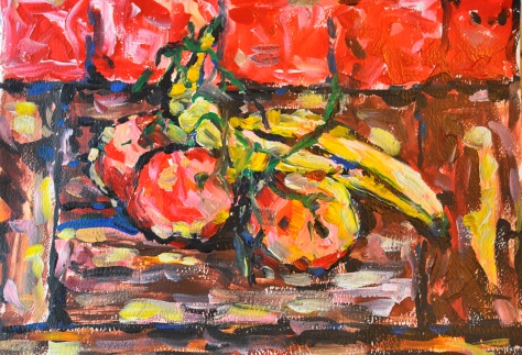
I started the project from impasto using a think paint brush and acrylic paint, I tried to paint placing a thick amount of paint onto the page experimenting how the paint combines with other colours on paper. For this exercise I found an easy composition of fruit and a bouquet of flowers. I tried to not pay attention to detail; I just wanted to create an effect using a thick layer of paint.

DSC_1432

DSC_1431

DSC_1430

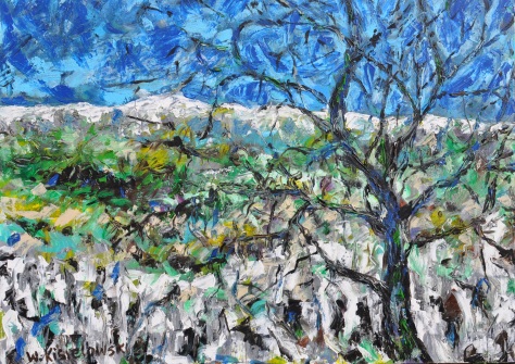
Next I decided that to get a good impasto effect I needed to buy some more equipment and got a matt impasto gel for acrylics and a heavy structure gel also for acrylics. I started painting using a painting knife and a rubber scratching pencil alongside a normal brush to create the desired effect. Before I started using every element I needed to decide what to paint and was not going to carry on with still life but try to paint a simple landscape, I chose a few photographs which I could use for the project and after a moment of consideration I came to the conclusion I couldn’t put as much detail into the picture as there was in the photograph. Using impasto gel it was easiest to use the painting knife and this means not putting in as much detail. I didn’t pay too much attention to the kind of landscape I just wanted to try out the technique using the photograph as a stencil. I painted picture with pine trees in the front to give the picture some sense of space with something in the foreground and background.

DSC_1419

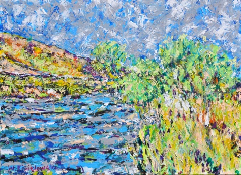
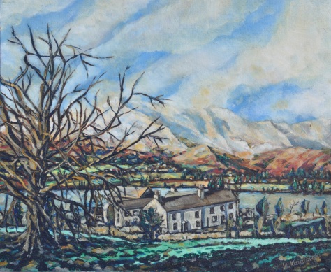
Next I decided to change my palette of colours and play with a different landscape with a similar composition featuring a tree in the forefront and hills covered in snow in the background. When I applied mixed gel with acrylic with the knife I also used a paintbrush to go over some detail.

DSC_1409

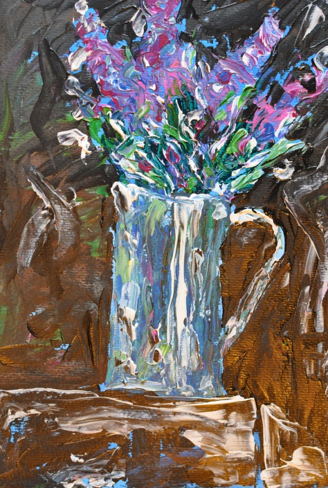
I next wanted to come back to a painting I have shown earlier and see how I can build a similar picture to one I have done already but using the impasto technique, it was of course simplified and details were missed out so I could use the technique.

DSC_1415

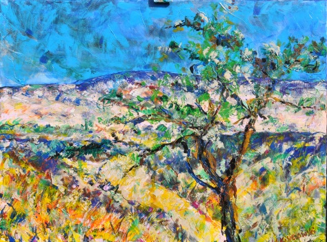
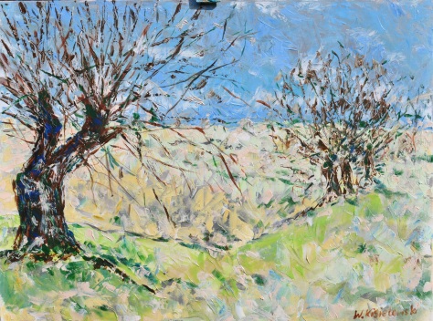
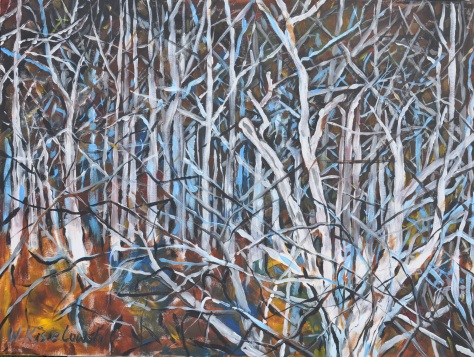
After finishing the painting I decided that the technique is very difficult and I needed to paint a picture where the forefront was simpler and calmer but the concentrate on the details of branches, I always found painting trees a difficulty so this was a little challenge for me. I didn’t want to pay attention to each leaf or branch but I wanted to show an impression that the trees are three dimensional and fit into the space.

DSC_1417

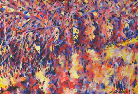
I now continued the tree theme using a painting knife but working more expressively and I also applied paint using a paintbrush dripping and almost throwing it onto the canvas. I had a few layers of paint with impasto gel and used a scratching method for further detail.

DSC_1411

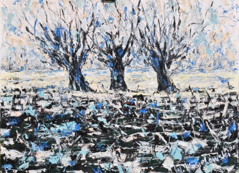
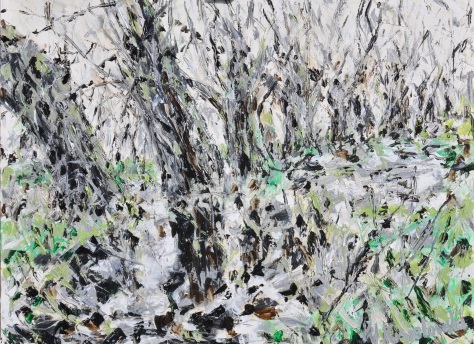
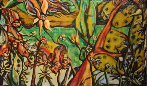
After finishing this picture I started to think about the main project and decided that the technique and process would be useful for the final piece. I used a photograph of willows near a lake, covered in grass and weeds. They are very fascinating trees with large roots coming out the ground and lots of branches. I used a similar pallet of colours to the previous painting and used the same technique.

DSC_1414


Project: Adding other Materials

I prepared two small A3 canvased covering them with toilet paper and pva glue, creating a texture. When I was applying the wet paper I didn’t really think about what I was going to create and when the canvas dried I had a dilemma of what to do with it. I tried to cover it with paint and seeing what it comes out as; I added a little impasto gel to give even more texture. After finishing with light shades I decided to add some bring darker colours. I decided that it resembled a blossoming tree. Next I decided that using heavy structure gel and acrylic I would add rice to the paint. I tried to see how the method could work and paint a abstract looking nightly landscape with a tree in the foreground. The two exercises were interesting and showed that I can add structure, texture and relief to my painting which in turn created a deeper space not using just paint which is expensive. The painting was a typical experiment and also piece of work with many luck accidents as the form of composition was created by the moving rice as it didn’t completely stay in place.

DSC_1427

DSC_1428

The next experiment was the final piece where I added hair from natural hair from brushes.

DSC_1422

Project: Towards Abstraction

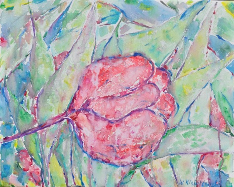
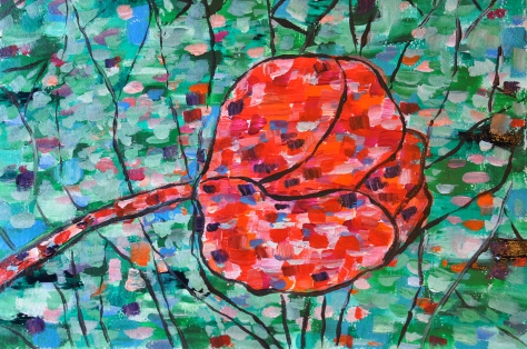
I started this project with but wasn’t completely convinced towards as the exercised don’t fit with my nature. I am not a painter who tends towards abstracts. Creating abstract painting is a natural process which lives inside an artist whereas I need to mature towards an abstract painting. I need to find a more natural way of creating abstract paintings. I thought for a long time about what to create and started with a simple form of a tulip and came to the barrier that for it to be abstract it needs to be painted in a different technique to what I paint. I did sketches using water colour and next on canvas I tried to create a water colour effect without having any idea of how to expand it into something abstract, I decided that I could express it as a tulip but some natural plant form. Next I decided that I would take the structure of the flower and paint it using patches and create a relief around it.

DSC_1425DSC_1433 I got the same problem with man-made forms. I chose simple objects like a brush on a table covered with a blue sheet covered in paint marks. I tried to arrange a few simple compositions so that I wasn’t paying attention to the detail of the brushes but to show them as objects in space, this was my only idea of showing an abstract illusion.

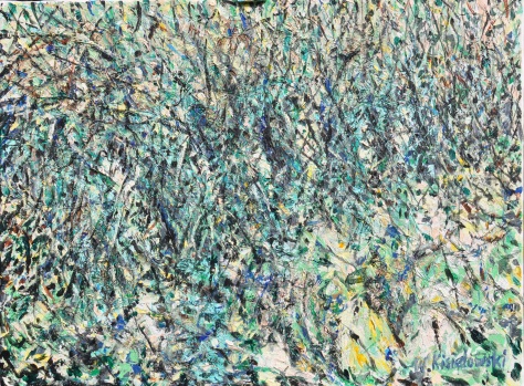
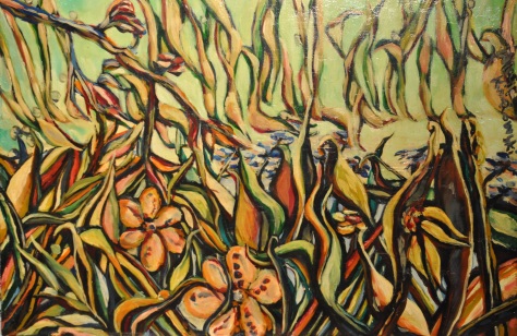
I was already working on my final piece at the same time and decided to try showing the willows in a more abstract way using unnatural red and blue colours.

DSC_1423

“The Challenge Of Landscape Painting” by Ian Simpson

This book is a guide to help painters look at landscapes in a new and personal way and translate this into a successful landscape painting. It looks at the challenges faced by those wanting to paint a landscape and why many artists are fascinated by them. The book discusses differences between painting on the spot, using a photograph and painting from memory and each advantage and disadvantage each method has, going in depth into each method. The thing I found most interesting was the illustrated interviews with many artists for example John Piper and Norman Adams. They talk about their experience in a very personal way, teaching us how they solve different issues they face and what they find most fascinating about painting landscapes.

The book isn’t aimed at a certain type of artist as I feel like it offers advice that anyone at any level could find useful and this is why I found myself looking into the book throughout the project. I found it particularly interesting that the book doesn’t specify a certain method of painting but encourages you to try out different things and experiment with what you personally feel is a good idea. This book is good for self development as it shows each artist has its own unique character and that they should follow it.

The book discusses effects of light, weather and composition and different media such as water colour, acrylic and oil. This was very helpful as you could see how different effect can be achieved using different types of paint.

Overall the book was a good resource to have as it showed the works of many artist and how landscape painting is developing. The different approaches showed in the book are helpful for any artist looking for an idea and putting them together allows one to create something unique to them. The book really helped me learn a greater understanding of landscape painting which was useful in this project.

Jackson Pollock

During the course, I looked for abstract artists, especially those who used the style called Tachism or ‘Action Painting’ like Willem de Kooning, Arshile Gorky, Robert Motherwell, Barnett Newman, and Mark Rothko. The most emotional and interesting for me was an American artist, Jackson Pollock

Jackson Pollock was an influential American painter. Jackson Pollock’s greatness lies in developing one of the most radical abstract styles in the history of modern art, detaching line from colour, redefining the categories of drawing and painting, and finding new means to describe pictorial space. He began to forge a new style of semi-abstract totemic compositions, refined through obsessive reworking. By the mid-1940s, Jackson Pollock introduced his famous ‘drip paintings’, which represent one of the most original bodies of work of the century. To produce in Jackson Pollock’s ‘action painting’, most of his canvases were either set on the floor, or laid out against a wall, rather than being fixed to an easel. From there, Jackson Pollock used a style where he would allow the paint to drip from the paint can. Instead of using the traditional paint brush, he would add depth to his images using knives, trowels, or sticks. This form of painting, had similar ties to the Surreal movement, in that it had a direct relation to the artist’s emotions, expression, and mood, and showcased their feeling behind the pieces they designed.

To this day Jackson Pollock is known as a leader in the most important 20th century American art movements just like William Shakespeare on literature, and Sigmund Freud on psychology. He created a new scale, a new definition of surface and touch, a new syntax of relationships among space, pigment, edge, and drawing, displacing hierarchies with an unprecedented and powerful and fabulously intricate self-generating structure.

I used some of his experimental techniques during my exercise. I don’t want to copy his style, but this abstract action painting is very powerful and I think I can use it sometime when I feel more confident in the future.

Image result for Jackson Pollock

One: Number 31 by Jackson Pollock

One: Number 31 by Jackson Pollock

Image result for Jackson Pollock

Max Ernst


I had a look at the work of Max Ernst who was a provocateur and creator of unusual art which questioned natural form as well combining different forms together that are usually not seen in the same picture. I had a look trying to find landscapes in his work and even though his work is meant to portray landscapes I don’t fully see this and find it hard to view it as one. He uses objects put together to create a landscape like effect but without it being clear or defined. It isn’t a literal landscape more a representation of one possibly also due to him interpreting Freud’s dream theory in his work to show his creativity. His landscape is like one out of a dream where everything is abstract and recycled from his imagination put together in a sort of landscape form. I myself could not find much usefulness in his work for my own work. I am writing about him to show that there are many different way of showing landscapes but my own ideas lie with the impressionists.

Max Ernst, L’oeil du silence (The Eye of Silence), 1943–44.

http://kemperartmuseum.wustl.edu/collection/explore/artwork/541


Gustav Klimt

I looked at Gustav Klimts work and was very surprised to find landscapes as I always associated his work with the female body. His work always has some decoration and erotic character. Looking further into his work I have realised that he had many talents and created a wide variety of work such as paintings, murals, sketches and more. The more exciting thing for me was seeing the series of Beech Forest painting he did, they contain something mysterious in them, we see unusual patterns of colour which create a certain type of composition but at the same time we can see only the colours and how they play with each other making us question what we actually see. If we were to cut out a fragment of the painting we would still be able to admire it without ever knowing that the original was meant to be trees. He uses the same techniques in his other paintings in the background or in the detail of the clothing. I can find similarities with other artist like Seurat or Monet only the difference the other pointillist artists, in my opinion, used warmer and lighter colours and lighting while he played with more contrast and that is why his patter had a different character. All of his compositions are more closed and don’t show open space but a more secluded and closed area. It is definitely worth looking through and analysing his work, I characterise him as one of the decorative painters.

Beech Forest Buchenwald I - Gustav Klimt - www.klimtgallery.org

Beech Forest Buchenwald I


Birch Forest - Gustav Klimt - www.klimtgallery.org

Birch Forest


Part four Looking out

Part Four: Looking out

Project: From inside looking out

Exercise: View from window or doorway

This exercise was very tricky for me to do as I have a very low viewpoint from my windows. The windows are very old sash windows located really low near the ground. I can only see the view while sitting down so I don’t have too much close up landscape views more things a little further away. I have painted the corner of Bolton Hall and some trees. Depending on the time of day the lighting is very strong and I can’t normally see both the window and what is outside. I have done two acrylic painting on A3 format. I used some of the inside of the room like the top of the sofa. I did these very quickly as the lighting changed quickly and this made the task difficult.


Exercise: Hard or Soft Landscape

For this exercise after the difficulties with the last exercises I decided to work from a different part of the house where the view is facing the north and the lighting is more stable and easier to work with. I decided to paint the stables that are attached to my house as I always wanted to paint them. I had a lot of time to work on this painting. I did a 91×91 oil painting. I’m not sure I did the whole composition right because I tried to capture it in a certain perspective but also couldn’t help myself painting the horses without which the stables would feel empty. I try giving impression of the stone wall and giving the wooden and metal structures to the painting.

dsc_1382


Project: Perspective

Exercise: Linear Perspective

For this exercise I chose to work with oils on canvas in landscape format 100×80. I worked from photograph I took from where I walk my dog everyday as I live in the Yorkshire dales. The photograph was only the guide to the painting as the landscape is one I know very well and observe regularly. I think this type of landscape is perfect to create a form of linear perspective. On one side of the river there is lots of dry stone walls which give perspective on the other there is barbed wire fencing, the river getting smaller higher up also gives a good perspective.

dsc_1383

Exercise: Aerial Perspective

For this exercise I found photos from a calendar from the Lake District. I found an interesting aerial perspective in the photograph. There is a certain depth where there are mountains in the background, trees in the forefront and an interesting middle part showing houses in a valley. I painted this oil on board 55×46. When I looked at it after a certain time I decided I was not happy with the effect it gives, you can’t see too much difference between the forefront and the background and everything seems very flat, it lacks space.

dsc_1373

Project: Expressive Landscape

Exercise: Creating Mood and Atmosphere

For this exercise I chose work from a photograph from a postcard showing the house of parliament in London. I worked oil on canvas in an A3 format. This was an interesting experience as I wanted to do something more precise and different. I needed to draw an identical landscape and had to square up and then draw on the canvas from the postcard. I don’t have a tendency to paint too many details, I always use a wider brush, but I wanted to create an atmosphere and experimented. I painted all the details like I always do but using turpentine so the paint dried really quick and after a few days and diluted some yellow and while paint with oil and I covered all the paint with a second layer so the previous layer mixed slightly with the second layer and the whole painting became more one, and an atmosphere was created. Next I wanted to do something different and I decided to paint on a 80×60 canvas with acrylic where the concept for the painting came about by chance when one early morning on the way to work where I walk past a small woodland area. When I put the outside light on or when it is a full moon, I always admire how the trees which normally have their own colour seem to shine and have a whiter colour in the unusual light. I was always fascinated by this so I tried to paint this creating a similar effect; I think the painting definitely has some atmosphere and mystery.

dsc_1363

dsc_1380


Project: Painting Outside

Exercise: Painting a Landscape Outside

I have had a lot of experience with painting outside, where I live is a private estate and a large far so I have a lot of privacy. I have done a lot of work outside during my watercolour and drawing course outside. The only challenge is the weather and my time. I made a few A3 paintings looking for interesting spots, like I said earlier there is plenty of dry stone walls, barns and green fields around. I also tried to work very quickly as the sky changed quickly as did the lighting. I sometimes had to work with great contrast when the forefront was light but the background was dark due to a dark cloud or it simply getting darker. I tried experiment on different grounds doing one on purple paper as I had one prepared. I just tried to do a quick sketch of the landscape not focusing on the colour just the distances between objects and the space itself. The next day I reserved the whole day to do an oil on canvas 91×91, where the view is amazing on top of a cliff looking through trees onto a hilly landscape. I tried to show a truly autumnal atmosphere.

dsc_1385

Project: Working from drawings and photographs

Part of theses exercise I have done during the earlier ones for example I needed to square up while doing the house of parliament painting. What I can say is working from a photograph is that I like using my own photographs because I can then alter it and crop and can create the composition I want as I know where the photo was talked and what I’m trying to achieve. I have great opportunity to play with landscape, the only thing I found is that sometimes these things don’t line up with the exercises and I have to go back and redo certain things or do things in a different way to how I would like to do them. I always try to use my sketchbook or previous work not only from this course but also from the watercolour and drawing courses, which means that if I have a problem with a certain element I can look back and see how I could possibly fix this problem. There are a lot of similarities between the courses but they are not joined so I have to do the same thing again just to fill an exercise. So I used a photograph and doing a painting oil on board 55×46 this is a painting from a calendar from the lake district, I had lots of photographs and looking through them couldn’t decide and my wife suggested this photo and I decided it was appropriate.

dsc_1372

During all exercise, I used different medium like oil, acrylic and tempera and on different bases such as paper and canvas. I find it more exciting to work with oil because I have more time for it to dry so I can add pigment of colour dilute it easier on canvas. Acrylic is quick dry paint and I need to work faster and different using it. I always like having a lot of paint on the canvas using less oil or water to dilute it, I work differently to when I use watercolour where there is more transparency. I think that oil or acrylic painting shouldn’t resemble watercolour, so I always try avoiding using transparent layers on my canvas. In my opinion different medium requires different techniques. When I paint I always have a problem of how to use the different medium to achieve how I am feeling and my own kind of expression.

I also created a surrealistic landscape using oil on a board. When I studied Max Ernst  works I liked to try to do something like him .

Oil on board 98×60 cm

dsc_1395

Oil on board 65X45 cm

dsc_1397

I also looked into the golden ratio and have found that it is more a mathematical concept that appears in nature and in art. I think a lot of the art that is shown to have the golden ratio is done subconsciously and appears to have a golden ratio because it is in a way a natural form of beauty and proportions. I have also looked into the rule of thirds which I feel like is more useful and more doable. I feel like it helps with showing a balanced composition and helps create a more satisfactory composition helping with placement of horizon and main focus. I think this is helpful if you are unsure of the composition or where to start or when you are cropping a picture to get the best viewpoint.


PART THREE PORTRAIT AND FIGURE

PART THREE PORTRAIT AND FIGURE

Before I started to do some work figure portrait and self portraits, I did a lot of research and I realise that most artists do that kind of thing. It was not easy to chose to focus on one artist who especially influenced me . I was confused sometimes between what artists present in their work and what the narration is. Sometime we see simple portraits, nothing special when we first look and when we look closely we see emotion, feeling and expression which the artist transfer onto his work straight from inside. Special portrait and self portrait is something in which all kind of emotion and feeling goes into straight from inside the artist. I realise all artists work we need to judge only with understanding of what some artist presents in himself. What kind of era he was in, what behaviour was in that era and what customs they had.

I started looking at artists that are familiar to me, what artist present outside his work, what life and meaning was.

So I looked for the greatest Polish painter of the Young Polish movement. Olga Boznanska was   born in 1865 and died 1940. Because I am Polish this painter is very significant to me and I know alot about her. This spring, there was a massive exhibition of her work in the National Gallery of Warsaw so thats why I think it’s important to write about her and learn some lessons from her work.

Boznanska’s art was greatly influenced by Wilhelm Leibl and Edouard Manet. Her work is a combination of realism and impressionism. She’s also one of the greatest of Poland’s portrait painters. Boznanska’s portraits include images of both adults and children, people solemnly posing or lost in thought. Her works, dematerialised and ethereal emphasize the spirituality of her models and are psychologically expressive. She, using dynamic brush strokes and vibrant colours, produce the effect of narrowing and flattening of space.

Her work had a lot of mood of intimacy and melancholy sometimes she uses very nervous brush stroke marks and shimmering colours always something atmospheric going on in her work. She often use range of palette dominated by browns, greens, grays and blacks and used whites and pinks to counterpoint her work.

My favourite paint is the well known painting is “Girl With Chrysanthemums”. This painting focuses on the model’s face. Conveying both their emotions and the mood of the moment, we can see traits of character of this girl. This painting looks like it’s been painted only using very few shadows of grey and brown colour but in reality Boznanska used about 80 different pigments to produce this piece and in the eye alone she used 8 pigments. She sophisticated everything in the harmony of tones using her great skills.

http://www.artinconnu.com/2008/06/olga-boznaska-1865-1940.html

Another artist which I got to know and everyone has probably heard of is Friada Kahlo, July 6, 1907 – July 13, 1954, she is mostly famous for her self-portraits. In looking at her work I wasn’t only looking from the perspective from art critics who sometimes describe her work as primitive, naïve and sometimes surreal but I also looked at her private life and read an interesting novel based on her life called Frida by Barbara Mujica, this enable me to look at her work from a personal perspective which showed the pain of her illness, her sympathies with the communist party, her romances and her life with her famous husband Diago Rivera. By reading the book you can admire all of her self-portraits and look at each one from a different perspective. You can look more deeply at the portraits from her perspective.

411193

https://www.goodreads.com/book/show/411193.Frida


PROJECT OBSERVING THE HUMAN FIGURE

EXERCISE DRAWING THE HUMAN FIGURE

For this whole part of the project, I found a live drawing class and I did a lot of quick sketches that took around 10-20 minutes. On my blog I presented some samples of the different poses of the female and male models. Because they were very quick sketches, it wasn’t in proportion. But observing human life drawings is a good way to get to know human bodies and drawing them is a good way to improve observing skills.

DSC_0163 DSC_0172 DSC_0171 DSC_0170 DSC_0169 DSC_0168 DSC_0167 DSC_0166 DSC_0165 DSC_0164 DSC_0173 DSC_0174 DSC_0175 DSC_0176 DSC_0177 DSC_0178 DSC_0179

EXERCISE LINEAR FIGURE STUDY

With this exercise I found it difficult as I didn’t know how to do the exercise- was I meant to paint and use lines and then later fill the linear painting with bold colours or use lines throughout the painting? In the end, I did a few paintings using few acrylic paints which resemble drawings. I tried to add some tonal valuation like in normal paintings.

DSC_0189  DSC_0187

DSC_0188

EXERCISE TONAL FIGURE STUDY

For this exercise I used acrylic paint as well and I started paining a simple outline which I filled in later with more colour. I especially concentrated on how the light appeared on the model.

DSC_0186  DSC_0185

PROJECT LOOK AT FACE

EXERCISE SELF PORTRAIT

For this exercise I used acrylic and I painted two self portraits. The first portrait was in brown colours. It was difficult to show the eyes and I think I painted the eyes too close together. I carried on the brush making and line painting like in the previous exercise and tried to shape my face to make it seem three dimensional. At the same time I wanted to add some character to my face and not look for the similarities only.

DSC_0184  DSC_0183

HEAD AND SHOULDER PORTRAIT

For this exercise I painted a portrait of my wife in acrylics. I find it difficult to paint someone that I know very well -was I painting from observation or from memory? I tried to not make it a normal portrait, just a moment stopped for a few seconds on my canvas. Painting a model from observation is not only work for the artist but for the model as well. I treated this exercise like a short colour study. I think I needed to do a couple more paintings with the model to then get onto the final study, or work quickly with all the mistakes but show the feeling and emotion. When I looked for portraits of other artists I don’t exactly look for similarities with the model but for the final work.

DSC_0182

CREATING MOOD AND ATMOSPHERE

For this exercise, I did a lot of research and looked at many paintings and I thought very long about how to exactly create mood and atmosphere because when I look at other paintings I can always find different kinds of mood. I started looking through my photo album and tried to find some inspiration for the exercise. I tried to avoid a simple feeling like a mother holding a child, or a mother weeping over a dead son on a battlefield etc. but attempted to do something unusual. Finally I found a picture I took of my wife, on a walk in the greenery and I thought it’d be interesting to transfer it to a canvas. I painted using oils on canvas around 100cm x 100cm. The enlarged picture did not have good resolution but that was a good thing in this case as the detail of the background disappeared and model appeared in the natural way on the first plain.

What I liked in this picture was the very natural pose because the model did not know I was taking this photo so it made it more realistic and natural. The model isn’t in the centre as half the body isn’t in the shot but in my opinion this painting catched some atmosphere and it catched a moment in time.

DSC_0206

DSC_0205

Conveying character

Before I started this exercise I did some research and I found the artist Ransome Stanley who  produced photo realistic portraits in dialogue with animals and showed it in an unusual way. They convey many different characters from character of people to the character of animals. First painting I painted for this exercise was a portrait of my daughter, from a photo. When I took the photo, my daughter was looking under the sun and had a natural grimace. Her eyes were were squinting. I wasn’t happy with this painting but conveying character is not only finding a face with characteristic grimace but we need to investigate more deeply in that way and look what is under the face and inside from the person and then try to convert to the painting. I did another portrait of my wife. One time I was observing the face of my wife and I saw how relaxed she looks when she looks at the TV and her face portrayed a warm character. I quickly painted her to catch that moment of feeling. I think that even if you don’t know my wife you can feel the same emotion as she. This work was influenced after I looked at the work of Salustiano Garcia Cruz from Sevilla.

He produced most of his work in Renaissance attire in deceptively simple abstract space. Most of his portraits are on a black or red background but the faces are realistic and beautiful but overwhelming.

DSC_0193

DSC_0191

Ransome Stanley was born in 1953, London, UK. He lives and works in Munich, Germany. He views the media as an archive, from which he selects and combines to create imagery through the staging of various image planes.Stanley draws on images from bourgeois culture of the nineteenth century, Western images of Africa and colonial clichés of exoticism to raise questions about race and identity. His paintings are often photorealistic portraits combined with animals, literature or pictures within pictures.

<em>For G.SCOTT</em>, 2012

http://www.jackbellgallery.com/artists/31-ransome-stanley/overview/

Salustiano Garcia was born in Villaverde Del Rio, Sevilla in 1965. His  work consists of  images which aspire to be more than almost-too-beautiful portraits which symbolise the very act of looking. His paintings are set in simple abstract spaces in presumed Renaissance attire. The technical perfection of the paintings is the pretext to seduce the viewer. He creates a connection with the viewer by adding a sense of beauty with the emotion and expression of the gaze.

WAR. Detail.

http://www.salustiano.com/red/

PROJECT PEOPLE IN CONTEXT

EXERCISE FIGURE AND INTERIOR

This exercise I didn’t do very successfully. I painted my wife sitting on my sofa and I used acrylic paint. I tried to paint the model in same way as all the interior. I think this was maybe the right way to show some interior scenes. In the end I made some mistakes. I think the model looks like an element of the furniture and didn’t show up well on my painting.

DSC_0181

EXERCISE TELLING A STORY

During the time of doing this exercise I was influenced by Adrian Ghenie, a young Romanian artist who mostly presents people in the context of using unusual form of expression like showing people without too many details on the face, too many details on the body but in the end its very easy to understand all emotion and context. And I tried using some of his techniques and I found a picture of my daughters and wife walking on the beach and I painted with acrylic and when we see that painting we can only guess by the background colour that they are people who are playing with the water or looking at something. I think the main thing in this painting is another natural moment rather than posed that I can transfer the photo to the canvas.

After, I did another one in a more experimental way, looking only for the pose of the models but putting it on a dark background. I showed this in a different context without the context of the sea. I tried to be experimental and do something with different meaning.

DSC_0196

DSC_0194

Adrian Ghenie, born in Romania in 1977. Ghenie’s themes are power and its abuses, as well as forced exile and migration. He guides us through both figurative and abstract images to show us his interpretation of history, using his highly unconventional compositions and stupendous techniques.

http://www.pacegallery.com/artists/144/adrian-ghenie


Part two: Close to home

Project: Understanding colour

After I did some research on Chevreul’s colour system I started doing all the exercises and I can only say in short that all these exercises are very academic when it comes to using colour. For example in exercise mixing grey finding the neutral grey colour was very hard to find as if you have a small scale the colour is not really neutral you have to make a large scale with great precision to get the true neutral grey. After doing this exercise and finding the neutral grey it can be said that it looks different on a white background and different on a dark background. This was similar in the primary and secondary colour mixing where the identification of colours was dependant on the pigments in the paint I used, I only had a limited amount of colours so this made the exercise more difficult. You can also see a difference in colour depending on what background it is on in the case of the colours. The exercise broken or tertiary colour was much more interesting as I managed to get a wider scale of tertiary colours. I am not really sure how to use this scale in practice as after doing the next exercise comparing colours I have come to the conclusion they appear to have a different temperature and appear differently on the canvas. I think that in expressionist or impressionist painting all tertiary or broken colours are made accidently and you see these colours when two or three complimentary colours are mixed. Of course if you look at classic painting all this is seen as it was deliberately done by the painter. At my stage it is good to understand and learn about colour but in practice to focus more on intuition and do the paintings in a more spontaneous way not scientifically analysing the colours. I have these views as there are a lot of important stages to planning and painting and if we only focus on this it might have negative effects on the painting but I do think that the exercises are very interesting and will come in useful in later stages.

DSC_9560DSC_9561DSC_9562

Project Still Life

Exercise : Drawing in paint

I do not have experience with paint and drawing. I had a similar problem in the watercolour course, so I decided to paint some objects like a sofa, pillows, curtains and a table and using black line to highlight the geometrical forms. I first outlined the objects, then I filled it all with colour and re-did some black lines to make them stand out. I am not sure I did that exercise properly. After that, I did another exercise with flowers, and repeated that exercise with the still life of apples and flowers; the lines appear more naturally

. DSC_9548 DSC_9559

Exercise: Still life with flower

For this exercise I set up a vase with flowers, and after doing some sketches I tried to paint still life with the flower. I am not happy with the two of them. However, with the pink flower petals, I made it look very flat and not very 3-dimensional. I probably made a mistake with my observation because I wanted to present all flowers in a real colour. I should have added darker colours to the palette, but if I did I think it would look like a different flower.

DSC_9549 DSC_9551

Exercise: Still life with natural objects

For this exercise I used some tomatoes, apples, and cauliflower. I placed everything on a white tablecloth, with a dark background. I think, after I painted the flower, it is better to use a dark background because it is easy to show the object in the space and show where the light is. I looked at some Dutch still life painters where often they use dark colours for the background, so I tried that. I tried to be spontaneous and used dark lines to show the shadow. I learned that from previous exercise.

DSC_9552

Exercise: Still life with- man made objects

For this exercise I painted a sugar bowl, a kettle and a teacup. I used the dark background again, and everything was placed on the white tablecloth. In this exercise I tried to show some geometrical forms on all these objects, and then I started painting all these objects in colour. I understood that you have to concentrate on the lighting and when I look carefully how the light appears on each object, I especially saw many different colours are on the kettle. The teacup and sugar bowl were already white in colour. I tried to find a connection between the background and the cloth. I used the same palette and the same brush marks, but i concentrated on that the man made objects differ from the background

DSC_9554

Project Colour relationships

Exercise: Exploring contrasts and successive contrast

When I did that exercise, I was influenced by optical art work such as Bridget Riley and I think about this exercise like a scientific experiment. It was not a very nice experience for me and my eyes to look at the bright complementary colours opposite to the spectrum. In my conclusion, this kind of colour mixing must come with some kinetic and geometrical connection. If I close my eye, all of the complementary colours still flash in my eyes. This effect makes some kind of vibration, waving and different kind of emotions. I can learn from that exercise how to appear some colour or some colourful objects to the first plan on the canvas making most visibility and bring most attention for the audience, make stronger specific mood.

Exercise : Colour  accuracy

In this exercise I painted a couple of onions, apples, a lemon and a bottle of wine. I painted each object separately, and concentrated on getting the exact colour of the object. I did not concentrate on the connection between each object. Only in the end I started to look for a connection between the background and the tablecloth by using the same brush marks. I think I acted accordingly to the instructions, because i concentrated on the colour accuracy of each object, but less attention on the bowl. But after I finish the whole painting, I realised that with the apple and the lemon, it looks like I have cut it out of a magazine or something and stuck it on. I think I showed some accuracy with the bottle of wine and onion and I think the onions played well with the background.

DSC_9555

Exercise: Still life with complementary colours

For this exercise I used Naptholene Carmine and Primary Cyan. I mixed this paint with white to get the lightest colour for lightest shades. I am happy with this exercise because when using both these hues I achieved many broken colours and I think I achieved some space effect and i use clear complementary colours in the front and many broken colours in the background. I think everything plays well and is well connected. It was very exciting and educational- I’ve learned much from this exercise. I think I can use the monochrome practice in the future because without using many colours you can still create a very rich palette. You can avoid mistakes with using too many colours.

DSC_9556

Exercise: Still Life with colour used to evoke mood

For this exercise I did not set up any still life but used my table as it was after a dinner party. I thought it would be interesting to leave the table as it was because it was a natural composition. Also, the background was interesting. I looked at the table from a distance and the light fell in through the window and the room was quite dark on the next morning. I did not concentrate on the shape of the objects, but attempted to recreate atmosphere of the morning sun. I tried to find the right balance between all colours that I used and made sure the light colours had a warm temperature and the dark shadows have the same strength. I made some mistakes in that picture, but I am generally happy with how I showed the light on the bottles. When I looked from the distance, everything looks like it has a very impressionist light balance. I think I played too much attention to the shape of the objects on the first plane.

DSC_9557

Project Drawing and painting interiors

Exercise : Quick sketches around the house

Exercise : Simple perspective in interior studies

I drew some sketches around the house, and I did a lot of quick studies, not only for this course but also for the drawing course and the watercolour course. I studied some interior painters as well, so I wrote about Nabis Group. I decided to use a simple perspective in my picture, and I found an interesting place in the corner of my sitting room. I used a different palette; I used more brown and more dark. I also used some line painting in this picture. I tried to recreate some perspective and I think I achieved that and we can see everything in the space clearly. I did not pay too much attention to the detail, but using the lines I set up everything in the space. To make that picture more interesting I used mostly same palette for each object and tried to define its size in the space. We can clearly compare size of the object in the background to the front.

DSC_9558

Yohannes Vermeer

One of the most famous Dutch artist. He was known as the Master of light. He only left 34 paintings but in each painting he could stop and capture life. We can find hundreds of academic work analysing his paintings. I can only say in short that the artist used great composition, colour and perspective is also exceptional. The artist joined realism with classical beauty.

The secret of his painting is that he used Camera Obscure. The first person to suggest this was American graphic Joseph Pennell, he was the one who noticed the photographic perspective. The focus point and object accuracy in paintings by the artist in the 17th century was something unusual.

The next thing I want to mention is the ways of painting light, its reflections and shadows on different objects. In reality light takes shape from its source for example the light in Vermeer paintings should have a rectangular shape of the windows but the painter has given it oval and circular shapes. The light disappears and flows through the painting in a very delicate way and still appears natural.

Another thing is colour. Vermeer used the highly pigmented colours but his pallet was normally limited to around twenty pigments and in some paintings he only used seven. He used a technique particular to the period called “Glaze”, using this technique the colours are very intense and light as if they shine from within. The Artist paid attention to detail and spent a long time on each painting. Every object had a meaning and was just as important but in some way he manipulated reality and focused our eyes on specific elements of the painting to give the painting a more mysterious feel. I can see some similarities between his and Caravaggio’s paintings. I was mostly inspired by two of his paintings ‘The Astronomer’ and ‘The Geographer’ where the main characters of the paintings are both found in the same room, the paintings have the same detail such as the same fabric, wardrobe, window and map on the wall but they are painted in different light conditions because of this we can easily compare the two compositions and make analysis on things such as how the colours appear differently in the different light conditions.

Click!

http://www.wga.hu/frames-e.html?/html/v/vermeer/03d/29geogr.html

Click!

http://www.wga.hu/frames-e.html?/html/v/vermeer/03d/28astro.html

CHIAROSCURO

Light and Shade are key elements to create the illusion of three-dimensional solid form. Our sight receives light which has been reflected from different surfaces. Artists look for many methods to create three-dimensional effect, not using real light and only using illusion of light on the canvas. One of these methods is chiaroscuro; chiaroscuro is the use of strong contrasts between light and dark, usually bold contrasts affecting the whole composition. The name of this technique, was thought up by Leonardo Da Vinci and for the first time he used this method in the painting called ‘The Virgin of the Rocks’ and he also wrote his first book about chiaroscuro. In this book he described many kind of different lights: primary light, secondary light, light from reflection, light through a window, light distorted in the distance and described light and shade is the most important thing to discover form of every object. Unfortunately Leonardo was an academic as well as an artist and because of this, he imagines where the light should be, not one hundred percent real it is created in his studio, even though the objects are outside, the viewers are led to believe it is artificial light. Leonardo Da Vinci always created his own light, be it the contrasting light in ‘The Virgin of the Rocks’ making the figures appear surreal or the gentle light shown in Mona Lisa

Leonardo da Vinci - Virgin of the Rocks (Louvre).jpg Leonardo da Vinci Virgin of the Rocks (National Gallery London).jpg

Virgin of the Rocks 1483-1486 Louvre                    Virgin of the Rocks 1495-1508 National Gallery, London

http://en.wikipedia.org/wiki/Virgin_of_the_Rocks

Another artist who used this method of ‘chiaroscuro’ was Caravaggio, the light in his painting was also made in the studio but is more dramatic, real and often falls at a shallow angle which makes the composition more dramatic. It highlights the character and the emotion of the figure at that particular time. For example Supper at Emmaus Caravaggio created nearly photographic realism due to chiaroscuro and we can see everything about the person including their features, physical faults and their actions from which we can interpret what they would say and do. This can be clearly seen in the painting ‘The Inspiration of Saint Matthew. 1602’. There are two painting of saint Matthew in which the composition differs in one the light is central and in the other the light is coming from the top, bot pictures are very dramatic and have a warm character.

1602-3 Caravaggio,Supper at Emmaus National Gallery, London.jpg 

Supper at Emmaus , London                                     Supper at Emmaus Milan

http://www.nationalgallery.org.uk/paintings/michelangelo-merisi-da-caravaggio-the-supper-at-emmaus

http://www.wikiart.org/en/caravaggio/supper-at-emmaus-1606

Caravaggio MatthewAndTheAngel byMikeyAngels.jpg

Saint Matthew and the Angel

http://www.wikiart.org/en/caravaggio/saint-matthew-and-the-angel-1602

The Inspiration of Saint Matthew by Caravaggio.jpg

The Inspiration of Saint Matthew ,Rome

http://www.wga.hu/frames-e.html?/html/c/caravagg/04/26conta.html

Yet another artist from this era who used light but did not use the realistic effects that light can give but tried to create light from within and with emotion was El Greco. He experimented in his work by using high contrast but was moving away from realism, often the figures in his paintings were distorted as if moving. the light in his paintings was not realistic like in Caravaggio and came from all directions even from the center appearing to come from within the figures. The figures are so expressive and loaded with emotion, the figures elongated and illuminated from an unknown source which can be seen in Opening of the Fifth Seal and Adoration of the Shepherds.When someone sees these painting they fit in more with newer and even modern art more than the art from the ear they came from.

El Greco, The Vision of Saint John (1608-1614).jpg Adoracion de los Reyes magos1.jpg

Opening of the Fifth Seal                                             The Adoration of the Shepherds

http://www.wikiart.org/en/el-greco/opening-of-the-fifth-seal-the-vision-of-saint-john-the-divine

http://en.wikipedia.org/wiki/The_Adoration_of_the_Shepherds_(El_Greco)

The next example I found was Gerrit Van Honthorst Christ before the High Priest, in which we can see an example of candle light, we can clearly see that the setting is at night with the only light source being the candle and only hitting the main two figures with the rest of the figures in the shade. In the painting we can clearly see that the composition is about the candle and the light it emits and not the colours of the painting which themselves support the setting of the night as during the night we can not see colours as clearly.

Christ before the High Priest 1617

http://en.wikipedia.org/wiki/Gerard_van_Honthorst

The last example of candle light is a painting by Georges de la Tour Magdalen with the Smoking Flame, in which the flame is painted in a very convincing way. While the light does not illuminate many parts of the painting it is the shadows, which is seen in most of the painting, that create the 3D effect. We can see a similar effect in his painting Job Mocked by his Wife, where the candle, unlike in the first painting, is not as strong but the contrast of the dark colours and shadow with the light creates the 3D effect.


Magdalen with the Smoking Flame, 1640   Job Mocked by his Wife, c. 1625-50

http://collections.lacma.org/node/238963

http://www.wikiart.org/en/georges-de-la-tour/job-mocked-by-his-wife-1650

I have named some examples here of light and shadow used in painting not every example was a chiaroscuro method because the chiaroscuro method is very hard to define but I have named examples of light and shadow contrast which is the main part of creating a 3D effect.

What paint can do

Project :

BASIC PAINT APPLICATION

Exercise: GETTING TO KNOW YOUR BRUSHES

There are many types of brushes, hard brushes used for oil paints, soft brushes for watercolour or medium ones that can be used for acrylic and tempera but all are for painting no matter if they are flat or round we can make any type of mark even with a big flat brush we can make small dots and a very thin line similar to a small watercolour paintbrush. When we are choosing a paint brush we first have to think about what kind of paint we are going to use the rest is just intuition and improvisation using the tools we have.

From memory I have painted a landscape for which I used large flat brushes and oil paint on canvas of size 50cm by 40cm. I also used a few smaller flat brushes of size about 6 but for most I just used the big brushes to make big marks all going in the same direction the smaller brushes were just used to paint the pond and get the desired effect of the water and also of the trees. The next day I came back to the painting and used smaller round soft brushes to get and over layer over the blue pond.

DSC_8724

After the landscape I painted on A4 canvas paper using oil paints some fruit and I used similar brushes the only difference is on canvas the brushes had a soft surface compared to the canvas paper where the surface was hard and this left more defined marks.

DSC_8717

Exercise: APPLYING PAINT WITHOUT BRUSHES

Using similar pallets as in the previous exercise I used painting knives and I painted on an A3 canvas using oil paints a small landscape from memory. I found this different from the first exercise as I used paint straight from the tube more and this gave brighter more bold colours with a smooth look compared to the other landscape where the paints were mixed and diluted with turpentine.  I think I can use the knife again to create a block of one colour when painting when the paint is still wet as this also gives a thinker layer of paint and so doesn’t mix with the other colours like it would if using a paint brush.

DSC_8713

Exercise: PAINTING WITH PASTELS

I did a few painting on an A3 format using dry pastels. I was not happy with the affect because when I added water the pigment is dark but when it dries it changes colour and fades. I think this technique would be useful with watercolour and give a similar affect. I also tried this with oil pastels but I think I used the wrong materials as diluting the pastel using turpentine on paper was very difficult and would have been better on rough paper or on canvas.

DSC_8734 DSC_8735DSC_8737DSC_8814

Project: TRANSPARENT AND OPAQUE

Exercise: Tonally graded wash

For this exercise I used phthalocyanine blue, violet and primary cyan colours. I had a couple of tries using acrylic paint as acrylic dries quickly. Two of the washes were too thick and became opaque. Wet on wet was much better. This exercise was maybe difficult for me as it was the first time I used acrylic to paint and I didn’t know all the properties of the paint. I have done this with oil paint before and when I wanted to do a transparent effect I diluted the paint with turpentine which made it easier, a down side to this is the drying time of oil paint.

Exercise: Overlaying washes

I did the second coat with a more diluted paint and the affect was much better and it is definitely better to do a few coats of more dilute paint than one coat of undiluted paint. I personally dot use a transparent technique very often and do not like it very much.  I used transparent technique in watercoluour painting and sometimes I put overlaying washes in oil painting. You can use this technique in many ways and for different purposes.

DSC_8746DSC_8744DSC_8742DSC_8745

Exercrcise: MONOCHROME STUDIES

I prepare two A3 canvas with washes of Yellow Ochre and Raw Umber oil paint. On the lighter I painted a tree from my own photograph and used similar colours such as Umber, Yellow and white. I tried to keep the colour in a narrow spectrum which can clearly be seen from the painting as to gain an idea of space and make the picture look more 3D I would have had to use more colours so I decided to stick to the topic as the painting still shows the atmosphere of the tree anyway. Painting on a light wash wasn’t too different from painting just on a white canvas but it was different when I started to paint on the dark wash on which I tried to create an old barn and dry stone wall seen in the distance from behind bushes in a night setting. This again was from my own photograph.  I wasn’t trying to paint individual branches but give the atmosphere of them being there. I used light colours which made the painting pretty straight forward. I did not put too much detail in the paining as again I stayed in a narrow spectrum of colours as you can see. After I finished the second painting I made a small A4 acrylic painting on canvas paper of the same photo in the same style and similar colours but on a white background to see if there was a difference in the painting on a dark background. From this I can see that the negative painting was much easier to create the affect I wanted.

DSC_8691

DSC_8707

DSC_8711

DSC_8781

Project:  WORKING ON DIFFERENT COLOURED GROUNDS

Exercise:  TONAL STUDY ON WHITE GROUNDS

I found a coffee set which has a metallic colour or you might see different colours because of the reflection. I painted two pictured on A4 canvas paper using oil paints, one using a blue and grey colour palette and a second using a grey and black colour palette. Both painting use a similar technique. I didn’t blend the colours to show the light but instead used a block of light and dark in the lightest and darkest spots. The blue painting was less successful.

DSC_8721

DSC_8719

Exercise:  TONAL STUDY ON DARK GROUND

On a canvas  of size 40cm by 50cm I prepared a wash using acrylic paint of phthalocyanine blue and then painted flowers using purple and pink tones with added blue. When I painted this I was inspired by Chiaroscuro and I was looking at the light. I didn’t want to show the shape of the flowers but show where the lightest and darkest points are and also leave the background untouched.  This was my goal but for the good of the painting I had to add some colour to the background as leaving it untouched would have left the painting separate from the background and I wanted to make the background softer and more gradual in colour. The shape of the flowers you can see more clearly in the back of the picture but at the front you really feel how the light overpowers the flowers and therefore the shape is not so noticeable.  I was however not happy with the acrylic paint as when it dries it becomes lighter.  When the painting was wet the contrast looked much better.

DSC_8821