Category Archives: Assignments – Drawing Skills

Assignment five The personal project

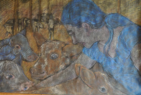
For this assignment I decided to create natural realistic scenes using pastel on card board called

“Woman looking after calves”. 
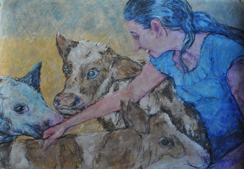
dsc_1192

(A1 format)

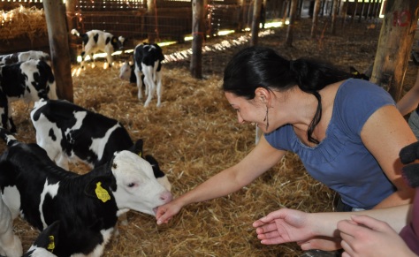
Before I started I took very long to think about the subject and carefully analysed my previous work and came to the conclusion that the pastel work spoke to me the most, especially the series of work with the calves. I did not want to copy previous work and wanted to create something new, a piece that would have a more personal character and a link to my everyday life, a piece close to nature. I started looking for materials and came across pictures in the barn with calves where I photographed a woman looking after the calves. I came to the conclusion that this photograph would be useful for my final piece. The photograph seemed very natural and gave me an idea that already seemed familiar. I remembered that I had seen similar scenes in a Polish artist Stanisław Wyspiański (15 January 1869 – 28 November 1907), who was a painter, poet and playwright and was known in the Young Poland Movement. An artist whose work was mostly pastel and portrayed mostly rural, natural scenes as well as portraits and became famous for his picture “motherhood” which shows his wife breast feeding his child, his work and that scene really speaks to me as it shows the natural happy feeling of the woman and I found this in my photograph.

Motherhood, 1905 Stanislaw Wyspianski


Self-Portrait with Wife at the Window, 1904

http://culture.pl/en/artist/stanislaw-wyspianski

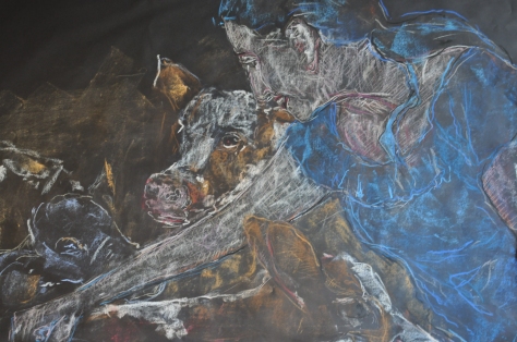
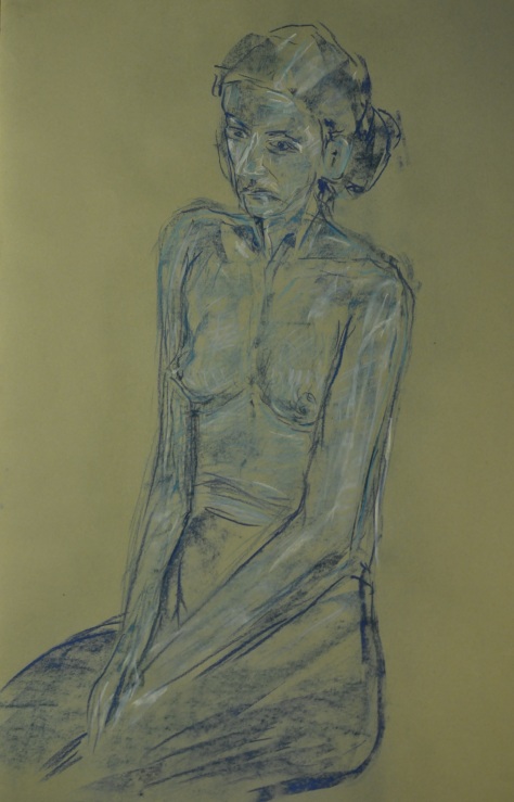
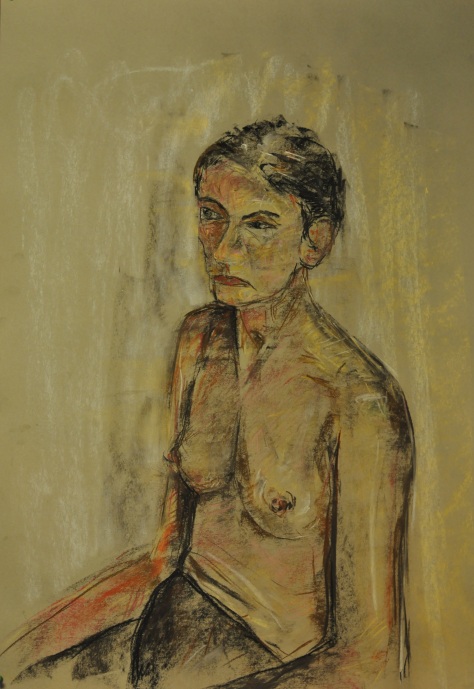
Of courses the photograph was just the beginning to finding the perfect composition. A happy scene resembling a mother feeding children was important; I wanted to distinguish between the human form, the animals and the background using pastel. I started doing preparatory pictures and tried to make the right composition but they weren’t speaking to me, there was too much similarity in them with the use of lines and also the figure of the woman wasn’t standing out from the background. I decided this was the wrong direction and I decided to concentrate on the task: mother feeding children, and make this the most important. The concept seemed very easy during the whole process of creating became very hard. I had to work in a more controlled way, less loose, less aggressive to show the difference between the woman and the animals. In the animals I let myself go with a little fantasy but in the woman all the lines and tones had to be different to the animals, both in colour and in expression this was the only way to precisely show the difference and focus on the sense of the scene. The next problem that arose was how to show the difference between the figures and also the texture and at the same time show unity between the figures making sure the woman stood out but was also share some characteristics with the rest of the scene. The work using colour is also a task as I didn’t only have to think about what lines I’ve used but also carefully analyse what colours I should be using and what temperature the colour with have. Tonal and colour evaluation was very important in this piece.

During this work I showed great control of manners, in my opinion I was able to show what was most important in the whole composition, I think that my work has a warm and friendly character and can be a stepping stone to creating similar work in the future. The pressure I put on myself, such as creating the said scene in my opinion was successful, I showed who I really was and what kind of expression talk to me. I was able to create, from many uncontrolled lines, a piece of work that shows my own way of drawing. I used my own knowledge of how to use tone and line and how to define the form and I also most importantly tried to show some emotion. My work is made of simple ideas but I think that it is a success. The figure of the woman is in complete relation with nature and the animals and I think some people will have the same feeling about this work. This work could be a step in the direction to developing more scenes like this, decorative warm feelings and also showing some emotion which was a characteristic in Modernism. I think the chosen medium that I used was the best choice and in a way it pushed me to create this work and not something different. I am fully aware that pastel and charcoal controlled my way of drawing but I am fully personalised with it.

In conclusion in my opinion my work imagination comes in pairs with expression. There is also space for experimentalism but also for personal feeling. The composition seems right, and the technique was limited by the medium I worked in but was arranged in the right way and my idea which I wanted to show is clear and has the right character.

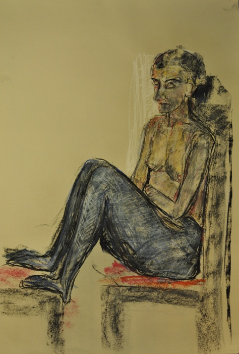
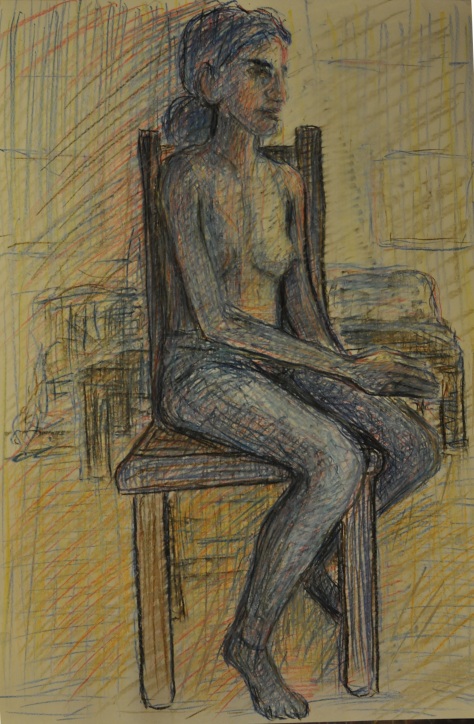
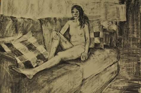
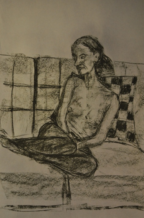
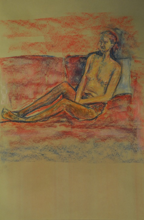
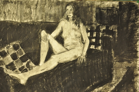
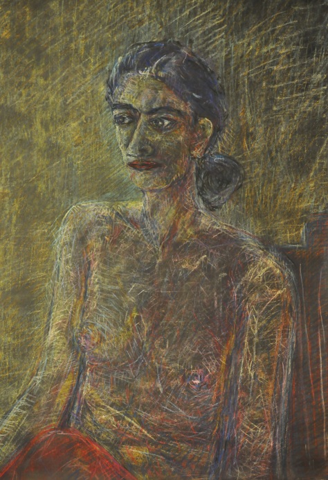
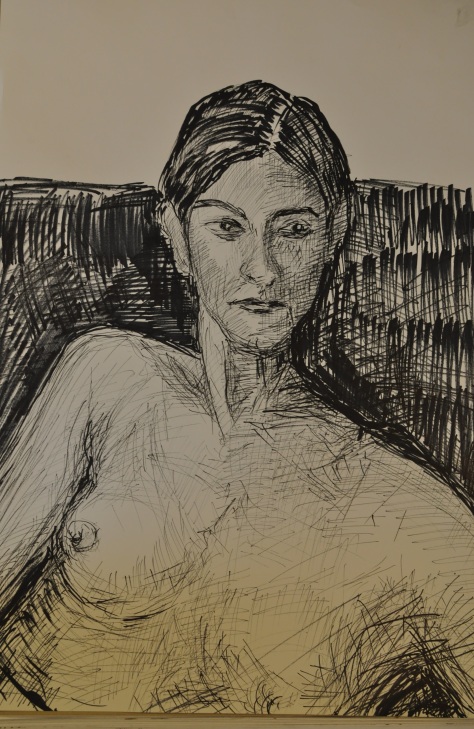
Preparatory pictures

dsc_1160

dsc_1164

dsc_7854


Assignment 4

Assignment Four

Figure study line- Seated model in an upright chair

The starting point for this was the exercise with three figure drawings where I started drawing a figure sitting on a chair. I worked on A1 format. The first drawing done in pastel was in my opinion a good starting point but it was not only a line drawing but contained tonal and colour definition, so I did another drawing taking inspiration from Graham Little who used coloured pencil but after analysing it the way I used the lies was overloaded and gives the effect that the piece is heavy and overworked, continuing this effect to create a drawing would require me to do a very long study to get the desired piece but the work would not be fresh or spontaneous. I then did a final piece using a soft pencil I started drawing using lines of a similar thickness and tried to show that the model is situated in space, I multiplied the lines in some areas ad made stronger and darker lines in areas that appeared darker, my model wore tight fitting trousers which had patters on them which I also tried to show, I rubbed out some lighter areas to add some dimension. I worked on this picture for about 2 to 2 and a half hours and I think I left it in the moment where I thought if I continued my lines would turn into a tonal drawing and then the whole interpretation of the drawing would have changed. I think this interpretation is good, repeating the same thickness of lines gives the work a certain character and I think changing the thickness of the lines would have made the piece look different.

Final piece

DSC_0949


Preliminary studies

DSC_0946


DSC_0947


Figure study using tone- Reclining model

For this I started with a simple drawing on A1 format, the first drawing was a drawing of a model sitting on the sofa in just tights, I then checked and some students did works without clothes and so I myself didn’t put clothes on my model as I thought this would be the best way to show the figure of the body. Also from my experience this was the best way of avoiding mixing the fabric of the clothes with the fabric that the model is sitting on, in no matter what way I arranged lights the body of the model has a different colour and texture to the fabric of the sofa. I think this is the best way to show the shadow and how it falls with comparison to its surroundings. I did two drawing using charcoal.

Final piece

DSC_0953


Preliminary studies

DSC_0944


DSC_0941


DSC_0956


A portrait or self-portrait combining line and tone

For this I worked with the same model and I tried to create some portraits, I decided to used pastels and do them in colour. I worked on an A1 format. I was happy with the preliminary work but in the final piece I decided I needed to do something more complicated and do something more personal. I wanted to create something different and so I worked on black paper which I filled with tonal definition and after I started using cross hatch line drawing and continued this using different colours, choosing the colours wasn’t random I tried to create space and use lighter colours in lighter parts and darker colours to create shadow. You could say that the line drawing is very expressive but the whole portrait when looking at it from a distance has a very static character. I wanted the portrait to be personal and using that kind of mark making make it original.

Final piece

DSC_0938


Preliminary studies

DSC_0925


DSC_0940


DSC_0939


Assignment three.

Assignment three- Lords Bridge in Wensleydale

For this assignment I chose to draw some old trees with a bridge in the background. This work was done half from nature and half-finished at home. This place is very close from my home and is located on the Bolton Estate. I know this place very well and it is in my memory as I walk by it every day with my dog and observe how the light, trees and surroundings change. While doing this work I used pieces from my coursework as most of that is also done in the same area. For this assignment I needed to choose an outdoor scene which included natural objects such as trees and some architecture element and then show perspective so I decided to draw my favourite bridge on A1 sugar paper, I tried to develop my technique and I thought that on a bigger format I could include more detail using pastels. After I finished the piece I wasn’t too happy as I achieved some perspective with the bridge but I am not happy as there it also appears flat in some places and does not appear to be in space. So I decided to do another final drawing on A1 sugar paper. I tried to show deeper perspective even though I didn’t put too much sky in the background. I tried to show the big branches in the foreground, put less detail in the other trees but still leave a feeling that there are branches there and put the bridge in the background. I also used a wire fence with the posts to show the whole work in perspective so now when looking at the picture everyone can see that everything is in the right place and in the right proportions.  I think this work fits all the assessment criteria and I have done my best to achieve some atmospheric perspective and the work in colour sometimes makes it harder but sometimes easier but I have achieved what I wanted to achieve.

First try

DSC_9842

Final piece on A1 Sugar Paper

DSC_9846

ASSIGNMENT TWO: ANIMAL STUDY IN INTERIOR SCENE

ANIMAL STUDY IN INTERIOR SCENE

For this assessment I decided to draw a calf in the calving yard. This is a continuation of the animal study exercise. For this work I used my sketchbook and took some photos. I chose to use soft pastel for this drawing. I chose this medium after doing a small sketch of the calf stall gate and straw.

DSC_9153

I wasn’t one hundred percent sure with this medium but I realised that the medium would be good to show the texture of straw and natural fur of the calf.  I started to draw on A1 green sugar paper the first calve hidden in the stall, I tried to see the composition and how it would work and describe the difference between the calve and straw.

DSC_9191

Then I explored on another piece of A1 sugar paper drawing a calf head peering out of the stall gate, I wanted to show the different texture of the calve and the steel gate and see if the pastel would work, I also experimented with the background.

DSC_9190

Next I did a third drawing on grey sugar paper which is a continuation of the drawing but this time I concentrated more on the colour of the calve trying to show it in different colours and see how the colour communicate together. I used tonal and line drawing for this piece and managed to get a difference between all textures including the background but I think the calf is too pale.

DSC_9180

So I tired another one in different colour so I drew a fourth drawing on black A1 sugar paper in which I wanted to use a different range of colours and also show the calve in a wider space which I found attractive. I still used the same technique to create the straw and I used more aggressive line making to create the body of the calf and at the same time I took more notice of background. For a while I thought this would be my final drawing but I was not completely happy and decided to try something different

DSC_9179

THE FINAL PIECE

The final piece I tried to use every technique from the previous drawings, while doing the drawing I learned how the colours go together and started to feel confident with the medium. In the composition the calve is standing on the straw in the barn and my first criteria was to show the difference between the calve, straw and wall using different mark making, mixing block of colour with line while creating a contrast between the colours but at the same time tying the drawing together. I was more experimental using lines in this piece. I think I managed to describe the form of the calf and place him in a space. I tried to use lines expressively and show the form of the calf at the same time. I tried to create an atmospheric impression of the calf. The calve was originally white with some black marks and covered in some dirt which was hard to show using colour and I think I only did this partially as I wanted to show shadow and colour of the calve but it wasn’t always possible as the lightest parts aren’t always the whitest. I think that in this piece I showed different types of mark making, expressively used lines and I think this work is quite experimental. Generally soft pastel was the right medium to use. While doing this work I wasn’t looking at works of other artists but I think I was influenced by works of Egon Schiele who inspired me with colours and lines in his magnificent work.

A1 cartage paper.

CSC_9212

ASSIGNMENT 1: REFLECTION ON TUTOR FEEDBACK

Reflection after tutor assessment feedback:

My first impression after receiving the feedback was very positive and I was very happy because it was positive. After a few days thinking about it I decided that the comment about my final piece was very short but fair. I completely agree that while doing the work I changed the viewpoint slightly and my observational skills weren’t very good. My intention was creating a good atmosphere in the work while still keeping some observational skills which was less important to me at that moment. I should have been more consistent and should have either kept everything in proportion not focusing so much on the atmosphere or I should have done the drawing in a more eclectic way. I agree with the comment about the different mark making and using more tones. I should be more experimental in my sketchbook and not being afraid to change my ideas such as adding more contrasting colours and lines. The truth is mentally when I am doing each exercise I try to do it correctly and this correctness in some way affects the result as I am not so spontaneous and can’t do things more freely. I feel like this is a problem that I should be able to someday leave in the past. I always have a feeling that someone is looking at my hands and at what I’m drawing over my shoulder and this stresses me sometimes. This assessment was very short and I did not get a chance to see the mistakes as the reflection takes a while and this is why I wasn’t always critical of my work. This does not mean that I am not critical of myself, I am very critical but it comes with time. I take all comments on board. I am looking forward to seeing more critical comments about my work, I think they really help to clear my head and quicken the process of improvement. I really liked the recommended artists to consider.


ASSIGNMENT ONE A PERSONAL STILL LIFE

For this still life, I chose my old accordion, my cowboy hat and my favourite coffee cup. I placed everything on top of my wooden drawers and I covered half of the drawer with a tablecloth.

Why these objects?

These objects are very personal to me, especially the accordion because I started playing it when I was ten therefore I had it for 30 years. The coffee cup is my favourite coffee cup; I drink out of it every day and it is also very old. I wear my cowboy whenever it rains, so I am very attached because rainy weather is very easy to come by in England.

Unfortunately, the placement of the still life objects is not very good. Natural light is not very good because it is not close to the windows, and it is close to the kitchen door where there is plenty of artificial light and the light changes every half an hour. But it is the best place in my sitting room to setup a still life, so I needed to compromise with my family.

I started this work with sketches using charcoal on A2 paper. I tried to observe how the light works in that area and tried to set the composition up right. I carried on; on A3 paper using conte crayons and brown, white and black pastel and I started my first attempt.

DSC_8423DSC_8421DSC_8418DSC_8731DSC_8730

MY FIRST ATTEMPT

My First Attempt was after doing some observation in drawing using a dark brown colour. I look for work that used sanguine brown conte crayons etc..

Unfortunately, I noticed that I cannot work on A1 format; I do not know why. I possibly didn’t check properly, I was too excited to start my first big project. Anyway, I wanted to show you this work because I was happy with a couple of things in that drawing. In my opinion, I managed to convey the character of my old accordion. I managed to do the effect of highlight in the front of my composition with accent on the cup.  Overall, in my opinion, the effect was very atmospheric. It is not the perfect drawing; I cannot push myself; it is my first big project and I do not know my boundaries.

DSC_8701

MY FINAL WORK

My Final Attempt was after doing some observation of graphics over internet, I was always a big fan of graphics and I went to the art shop and brought various types of ink nibs, and I used reed pens before so I wanted to go further with my techniques or try and mix them together. So I set up the right size of A2 cartridge paper and I started working with that.

There was a problem with the ink- I could not use it on the easel. With the angle that you work with on the easel, the nib didn’t hold much ink and work was very difficult so I moved to the flat table and the angle of the work changed. I reckon I drew the cup too big but I left it like this because I thought it will bring a good effect- the cup in the centre and light concentrate on the cup and keyboard.  Obviously, when working with ink any mistakes you cannot fix so I tried to play with bad marks and lines trying to cover it up, and I also used white ink to make some more highlight lines in my drawing. The white ink wasn’t so good and it made some yellow marks. I decided to leave it like this because it looked like I was working on old paper in some places. This gave an aged effect on the drawing.

DSC_8755

Reflection on the assessment criteria

Demonstration of technical and visual skills – materials, techniques, observational skills, visual awareness, design and compositional skills.

I think I have demonstrated some technical and visual skills. During the process I used various different materials and I worked on different techniques on different types of paper. In my opinion the composition and overall design was not bad. I achieved what I wanted.

Quality of outcome – content, application of knowledge, presentation of work in a coherent manner, discernment, conceptualization of thoughts, communication of ideas.

I think communication of ideas is pretty straight forward and I am confident to present that work for assessment. Unfortunately I also feel inappropriate to comment on the other items in this category.

Demonstration of creativity – imagination, experimentation, invention, development of a personal voice.

I think my work shows experimentation and invention. I tried to not do a pretty picture but I tried to use my own technique, my own creativity, and create something interesting and different and create an atmosphere. I think you can see my personality in my work.

Context reflection – research, critical thinking, learning logs.

I undertook the research required in the course materials. No research was directly applied to this final piece but I did some observations like I said earlier. This is my first assignment and my first part of the course. I find sometimes extremely difficult to do some coursework and during my final piece because I am not confident. I think I approached some of the coursework too seriously and because of this I think my work lost its freshness. I think that I overthink I should let my hand free!