Project 1 Working on different colour grounds
Exercise: Tonal studies made on coloured ground
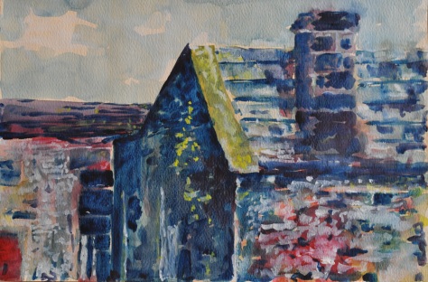
For this exercise I decided to come back to my previous assessment and try to create a landscape with the old barn on the farm. I decided it would be a new experience with creating the same scene but on coloured paper, at the same time for the first time I started using a white colour. My conclusion is that if I want to achieve the lighter parts of the picture I need to use more opaque acrylic because when it dries the white is quite transparent and wasn’t very noticeable or strong.
Exercise: Drawing on coloured paper
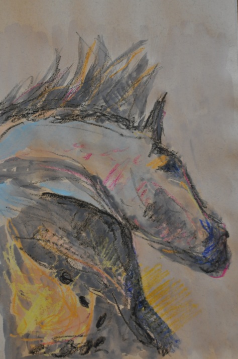
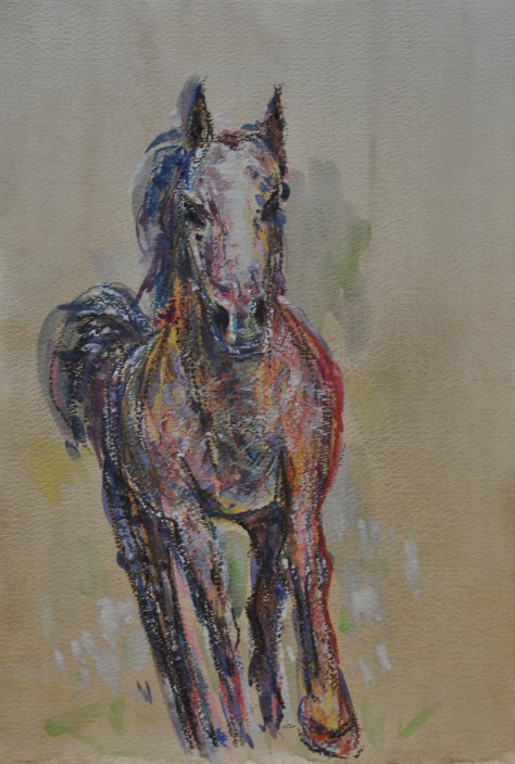
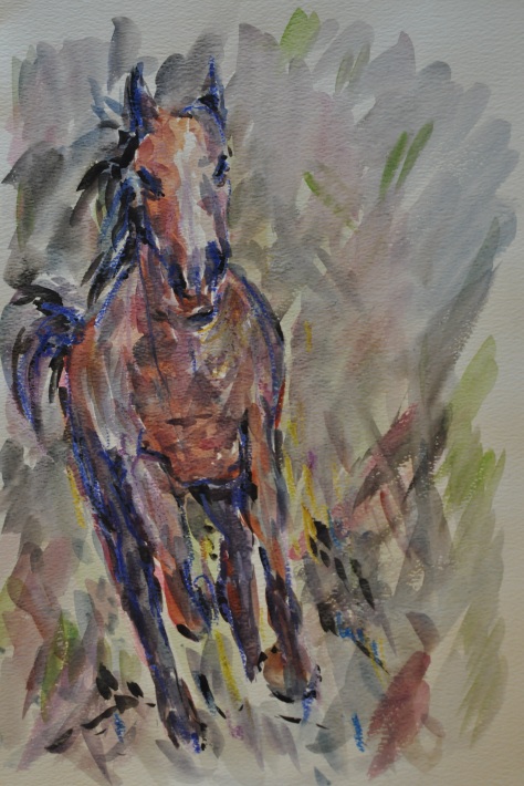
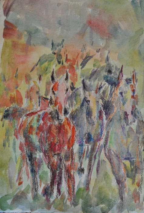
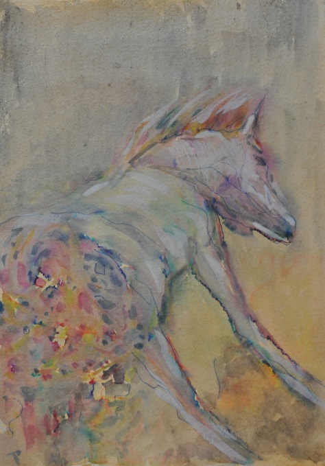
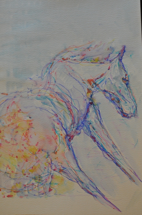
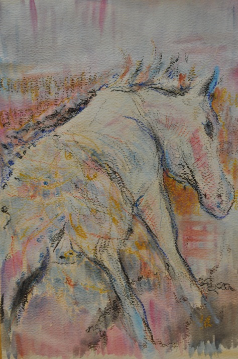
In my sketchbook on grey paper I started drawing a few horse’s using pencil and next gradually started to add some colour and also experiment with using white. I tried to work quickly so the work seemed spontaneous and the lines of the drawing played with the colour.
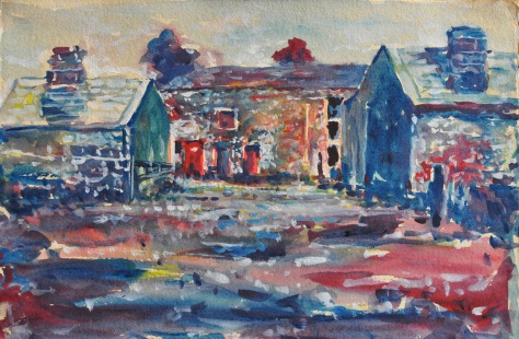
Exercise: Painting Landscapes on coloured paper
For this exercise I painted two landscapes but I am not happy with them. The washes I painted them on were slightly dark and I couldn’t get the desired colour, it just seems dirty. My expectation before I started was completely different to the one I achieved. I would definitely not call this clear watercolour, if I were to continue I would do this in acrylic or oil and not watercolour. If I tried to achieve a colour and then put on a second layer my work became dirty and less clear.
Project 2 Working with mixed media
In this exercise I worked on white and coloured paper. Most importantly I decided what I would go for the final series of five paintings. The first work I created was a portrait of my wife on coloured paper, where in a bigger scale I had less small detail and more bigger areas, this made the colour more clear and clean and this made the whole work more readable. Next I started experimenting with using different techniques such as crayons and felt tips on white and coloured paper; in some way they are continuations of drawing and painting on coloured paper. Using white crayons I achieved some resists technique effects. I have experimented like this for the first time working very quickly not particularly caring whether the picture and scales are accurate, I just tried to use a richer pallet with different colours and check how these techniques work and correspond together. I learnt a lot from this as I could see in an uncontrolled way the difference between working on a white and coloured paper, I came to the conclusion that some works on coloured paper are just as expressive but only when I feel fully free. My previous exercise with landscape was a bit of a disaster, in these works I saw hope. I am also very concerned about using mixed media or going to pure watercolour in the future, I think I will need more time and will stick with what I achieved on white paper in the previous exercise. I do not feel safe to do that kind of work for the assessment at this moment in time.


Project 3 Toward abstraction
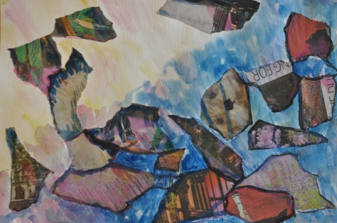
Exercise: Collage made from random elements
I am a big fan of Barque and have written on my blog about him before as well as Picasso but this exercise is difficult for me as the whole idea of collage doesn’t speak to me. I followed the instructions and glued newspaper onto a sheet and I looked at what happened which wasn’t much. I really don’t have an idea how to create something from this work so my first idea was that the pieces of paper look like comets or meteors shooting through space, so I added some colour around the edges to create some more 3D vision, in some areas I added colour onto the newspaper but I stopped as I had an urge to paint over the elements covering them completely, where they would just be the shape but I could create what I want so I it would lose the feel of a collage. When I looked at the picture from a distance the work does look like meteors in space so I left the piece there. The element differs in colour which seems like an interesting composition.
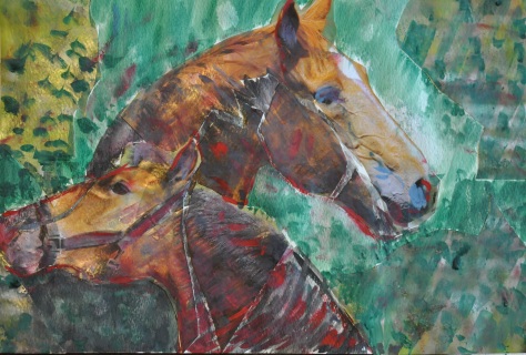
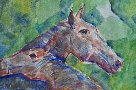
Exercise: Themed collage and painting
For this exercise I used photos from a calendar and cut them into pieces and stuck the elements down with gaps in-between but again came to the conclusion that again I want to paint over the elements and create my own vision on top. This is not what the exercise is about. I could not achieve something absolutely abstract using a realistic form such as the horse’s head I used; it didn’t become an abstract form but remained a horse’s head. The only thing I tried to do was mask the character of the photo and give them a painted feel. Next I painted another work based on the first which came out very realistic, the only thing I did was in the background I tried to achieve a collage effect. I have a bad feeling about this, all collage exercises don’t speak to me and maybe it is too early for me to work with this media.
Exercise: Magnification
For this exercise I chose to work again with horses and first did a hoof in a large scale, next I painted a fragment of the head with the eye followed by a whole head in large scale. In this exercise I learnt that I always see too much detail in one area or point, I should be using a wide large brush and that is how I start but I then take a small paintbrush as I see all the other detail which in reality I am not sure are actually there or if they are just in my head and I think that I should add more. There is always a texture or light that influences the surroundings and there is always something happening which I want to add.

Exercise: Free Expression
For this exercise I chose some tasks like 3.00am for example where I started thinking about what I do at that time, which is the time I wake up to go to work, my way to work and as it is always in the night I just see the skeleton of the building coming from the darkness. This was quite a strange experience because I started to feel some anger as no one likes to wake up in the morning; this is what made me use red sharp colours. Next I chose task birth where I imagined a woman giving birth but I needed to show it in a more controlled way which isn’t showing it figuratively but shows element in my idea should show birth. I chose a very sharp and contrasting pallet. Another piece I did was quiet night in which I started to place element of squares, rectangles and triangles on the paper and next I started to feel the quiet night or feel what I would feel and with the paintbrush started using round strokes like you see on the picture. I calmly wanted to lose the hard elements in a dream. In my opinion all three topics I chose from the first thought the idea changes when I started to paint. The whole progress of the painting changed, maybe only in the second the colour and shape remained at the same time it was hard to keep the elements clean, I had to stop every few moment as it was going too far and I was scared that the elements would get lost, if I had continued I would have done too much. Maybe I was too influenced by Wassily Kandinsky where his composition of element have a clear character. We ask the question if he didn’t give a name to his compositions would we just be guessing what they portray or would we be left guessing. I am not sure.
Exercise: Working with music
I did some experimental things with different kinds of music; I found this task very hard to do as I play instruments and have a musical background. While listening to music I naturally react to rhythm and can copy each interval. So when I listened to music I always play with my fingers on the table, so I decided to get a watercolour pencil in one hand and a paintbrush with watercolour in the other hand. I first listened to Jimmy Hendrix and tried to show the aggressive sounds which shown in the painting as I did very aggressive movements with my hands which created aggressive lines. Next I listened to classical music where I was doing smooth and calm round movement and adding colour later. Lastly I listened to some jazz which is always very calm and then goes into improvisation and more aggressive music, it is always varied, so I used some different lines doing calm and aggressive lines (not as aggressive as the first). After this exercise if I showed these to my friends they would not know what I did but they are also a great way to find some expression and finding different ways of mark making. This could be used in a more controlled way in other work. This is a great way to achieve some abstract and at the same time I must be honest I am not yet interested and ready for it. Normally when I work I listen to music but try not to let it affect my work because if it did my work could be unrecognisable.
Working with music reminded me of a very successful polish artist Michał Misiak, the artist works in Krakow. He is one of the most interesting geometrical abstract artists in Poland. His work are structures build from hundreds of gently moving lines which create vibrations and movement on the canvas, his work is a form of optical art. In this method his work doesn’t portray anything recognisable object but intersecting long thin lines. I had a chance to see his work, the colourful paintings as well as black and white and always have a feeling of impulse of sound or music falls into the painting and next his work starts to vibrate and wave like sound. This artist has spent the last decade creating this work, he has created his own style but I always have a feeling like different sounds come on seeing his work.
Misiak abstract paintings .


Michhttp://www.sztukpuk.art.pl/assets/galeria%20sztukpuk/misiak/index.htmal


