Assignment two
Make a drawing of subject of your choice using the subject itself, or tools constructed from the subject, dipped in or paint.
I thought about this assignment quite accidentally while working on the first exercise in which I drew several drawings with wolves. I spotted a few wolf photos in the woods that looked like they were hunting or ready to attack. From the beginning, attention was drawn to the proportions of the front legs compared to with the rest of the body which seemed larger, the perspective from which they were photographed gave a strange effect, the wolf’s front was very massive, the rest was hiding in the background. I deliberately searched for several photos that use fish eye perspectives.
I found the tools that work well during the work would be black ink, the forest/trees and everything that will create a background will be made from bamboo stick or other wooden sticks available to me and to draw a wolf fur I will use an old brush with hard hair, I found I can use the dry brush method, I think that these tools are consistent with the form included in the subject of wooden elements for trees and a hair brush for the definition of fur.
My first approach was to draw a wolf in the same composition which I presented in the first project, I wanted to narrate a very readable sketch so that he would introduce a kind of monster from the forest or a form of the devil, deliberately enlarging his limbs and deforming the rest of the body, such an eclectic figure it’s very interesting,
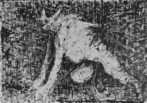
So I decided to broaden the subject and draw the wolf’s character from the front in this very different perspective. Whereas I mentioned earlier, the legs seem to be longer, I decided to make them more alive while remaining in this devilish narrative.
In the background, I decided to draw the next wolves so far in a very eclectic form, and it was my big mistake that I would start thinking how to put these creatures in space. I should have suggested earlier how to better integrate wolves into this space but in the ink drawing it was already too late to fix it.
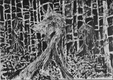
I decided to draw the next work changing the topic from a dangerous wolf to the figure of a lightweight polar bear I found a few objects where the proportions of front or rear legs relative to the rest of the body would seem abnormal, and in the same eclectic narrative idea how to better place this object in background. Completely accidentally I started running out of ink, so I decided to dilute it with water, which allowed me to get a better effect while painting the fur.
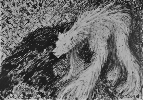
To make the whole composition more dynamic I added a very dark shadow in the middle so that even if the polar bear appears to be drawn in a very soft way, the whole composition is more contrasting and vivid.
The next drawing was a similar figure of a bear, but I wanted it to exist in a different way I wanted it to emerge from the trees so that the trees and bear were part of the foreground and see what the effect will be, unfortunately I failed to get a similar atmosphere as in the previous works. The bear is not as visible as the figures in the previous drawings, I decided that I would come back to this composition which would require more experience.

Then I decided to try to draw a group of polar bears as in the case of wolves.
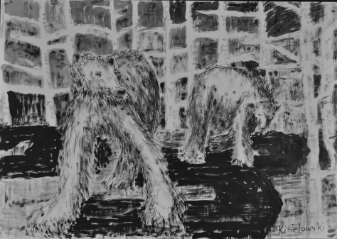
In the foreground, big and in the middle, smaller, after drawing I decided that the whole narrative has changed here giving an atmosphere of terror, as everything seems more stable and soft, boring in one word so that I decided to create atmosphere and add some more black parts imagining shadows in the middle of the drawing in a very geometrical form, and this geometrical form slowly expanded to draw the forest in the background. The dry brush created a very interesting structure when drawing the forest in the background, I think I didn’t use anything else but the other tools because the relationship between the figures in the first plan and what is in the middle and in the background seems very interesting, contrasting and similar at the same time
In the final work,
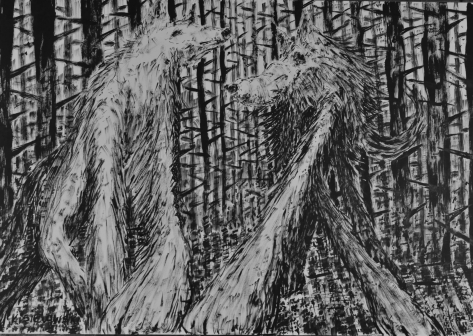
I decided to use two different narrative effects and combine them into one composition, soft polar bears and a devilish wolf as foreground characters and a less aggressive forest in the background but made in a way that focuses our attention, some kind of perspective tree stand projecting the same fish eye. Of course, I made a womanish form to the wolf by slimming her figure, but the length of the lap and fur on them is drawn in a different way than in a man, it is whiter and softer, less aggressive. I think that during this whole work on this project I underwent some kind of analysis and experimented by creating various forms of compositions with the use of quite inaccurate non-precision tools. When using wooden sticks, accidents can happen, I tried to rub them or use them. I worked on a large format on an easel, keeping the ink on the stick just made it difficult. With a stick, I could only draw in a specific direction. I think that throughout this project I used the experience I learned during the exercises, but I devoted all my attention to building an appropriate narrative. So, the narrative is the leitmotif and then the work on the composition of the image, I paid particular attention to maintaining a proper relationship between what is happening in the foreground and what is in the background. I have considered the behavior of these relationships as a very important element of my work. Did I succeeded? I do not know, but I estimate that my work meets all the criteria and I am determined to present for assignments.


