Project 1 COMPOSITION
Exercise 1 Compositional sketches of man- made objects
For this exercise I used charcoal and later I changed the medium to a soft pencil. I worked on A3 format. I chose a loaf of bread, wrapped in transparent paper, with a bread knife, on the cutting board. With every sketch I changed the position of the bread and I also pulled out the bread from the paper. I used natural light, so with every sketch the lighting changed. After that exercise, I understood that I made a mistake because I changed the position of the bread but not myself, and that would have allowed me to have a completely different point of view. It would be better if I changed more in each drawing. However, you can notice the shadow is slightly different in each drawing.


Exercise 2 Compositional studies of natural objects
I found an interesting place near my fireplace, and the fire tools caught my attention. I used charcoal on A3 format paper. Charcoal and fire tools are an interesting combination. This time I changed both my own position and the items. Each time I used slightly different mark making. If you compare all four drawings, I did not pay much attention to the proportion of each individual object.


Project 2: PHYSICAL AND VISUAL TEXTURE
Exercise 1: Experimenting
Using pencil and pen, I drew four different objects with different textures. I drew a kitchen sponge, a block of wood, a pineapple and a slice of bread. Later, on another drawing I tried to draw a fragment of fur scarf. I did that drawing just for experimentation because I wanted to try to make the illusion of fur. I am not happy with that drawing at all. Later I did a composition of items. It is difficult for me to tell what the drawing is off as I did a frottage of random items. There is money, kitchen tools and a matches box. I used normal pencil and charcoal to make a difference between mediums and make a more contrasting composition.


PROJECT 3: DETAILED OBSERVATION OF NATURAL OBJECTS
Exercise 1: Using marker or dip pen
For this exercise I did a couple drawings using felt tips. I do not have much practice with using felt tips. I just use that exercise to be familiar with that medium. In each drawing you can see how I tried to do different marks; thin and thick lines. Thanks to that, each drawing is individual.


Exercise 2: Detail and simple line
For this exercise I used black fibre-tipped pen and I made two drawings of Hyacinth flower . I tried to catch some texture of the plant, at the same time I tried to draw very lightly but to not take the pen off the paper. I do not know if I did the right thing by drawing very lightly, perhaps I should have drawn more aggressively, it would have added more contrast to the drawing. On the other hand, you can see the different texture between the sleeve and the bulb.


Exercise 3: Detail and tone
For this exercise I used coloured pencils and I used cross hatching technique. I tried to show light and dark tones of each object. I chose garlic and a plant. I tried to make some contrast between each object and I added some line drawing as well in the lightest and darkest areas. In the second drawing, I did not pay too much attention about the colour of the garlic but instead I concentrated on the light tones because I find the connection between the background and the vegetables interesting. When you place the white garlic on a coloured surface, the colour of the surface is reflected in the garlic. I tried to show this in the drawing.


PROJECT 4: STILL LIFE
Exercise 1: Still life using line
In this exercise, I concentrated on stacked plates after dinner. The viewpoint was interesting from above. It is a natural group of objects placed together. I used some markers for this drawing and I made sure that the lines held the shape of the objects. Later I did another drawing using the markers and I placed some plants and fruits together and using a different kind of line making, I tried to describe structure of each individual object, and at the same time I had to use similar mark making methods for each object in the drawing


Exercise 2: Still Life in tone using colour
In this exercise I used colour pencils. I used similar mark making only I concentrated on how light falls on each object. To highlight the main light I used a rubber to make the lightest parts most prominent. Later I did another drawing of an orange and a plant. I think in this drawing, the bottom part with a stool and a cabinet, was more interesting than the plant and the fruit.


Exercise 3: Experiment with mixed media.
I do not have too much experience with mixed media so in the first drawing with plant, I did some experimental drawings. I mixed markers with oil pastel. Later I took another direction and in the next drawing I used markers with soft pastel and using a brush I diluted the drawing and I achieved a watercolour effect with some strong marks. At the same time, I noticed the markers also dilute with the water. So the drawing is not very good, but I realised that this is a technique I can use in the future. After, I drew the view to my kitchen using the markers and the soft pastel. I used the same technique as in the previous drawing. This drawing can also be used as a interior composition exercise.


Exercise 4: Monochrome
In this exercise I used markers, and I diluted it a bit with water. I learned that technique in the previous exercise. In the first monochrome drawing, I was not happy. I think the markers smudged too much therefore it did not look good. In the final monochrome drawing, I used a similar composition as in the line drawing, with the high angle view. I tried to do some expression with the glass and cutlery, so you can see the difference between the glass, metal and porcelain. At the same time, I attempted to use monochrome colours.


PROJECT 5: PETS AND OTHER ANIMALS
Exercise 1: Animal Life Study
Exercise 3: Live Animals- using line and tone
I did two exercise at the same time. I do not have a pet or animal at home, but I work on a farm with cows and calves so I got my sketchbooks and went to the calf house, where I started doing some quick sketches using quick lines. I tried to change the medium from pencil to markers and pastels. It wasn’t easy drawing animals because of the movement, and this is why the sketches might not be accurate in proportion. Because of the fragile, small and out of proportion structure of the calves, when in standing, moving or resting position, it is not easy to see the full skeleton form. I did a couple of sketches and I changed the medium to charcoal, and this was for the line and tone drawing. Charcoal is a good medium for tonal drawings. I did four charcoal drawings on A3 format, and for the final one I used charcoal on an A2 format.


Charcoal drawings on A3


Charcoal on an A2

Exercise 2: Tonal study of bones and shells
I didn’t find any bones or shells in my home, but I really tried to carry on my exercise and I did two drawings of horns, changing position in each one. I think the first drawing is much more contrasting than the second, and can show some perspective from that view point. I think my second drawing is too pale; I tried to describe the shape and that horn was very highlighted in the moment I was drawing it.


Exercise 4: Using source material
For this exercise, I used a photo of a cat x-ray. I did not copy the x-ray photo. I tried to make the drawing interesting by doing not doing it similar to an x-ray fashion background. If you look from the distance, you can see the shape of a cat or you can see it as a fossil. I think I did too much line drawings around the legs and the head, and also where I did the dark tone around the head, I should’ve done the darker tone around other areas as well.

PROJECT 6: AT HOME
Exercise 1: Quick sketches around the house
In this exercise, I made several quick line drawings. I selected only a few of these drawings to include here. I used some pen and marker. What Ii found interesting in this exercise was when you look at the room, you normally see everything as a whole, but when you look at the details, you get a whole different viewpoint with different dimensions and shapes. It is like looking through a camera, finding the different angles by moving just slightly. And you can find interesting compositions in ordinary shapes at home.


Exercise 2: Composition and Interior.
For this exercise I used charcoal, and I found a place on my cabinet with a lamp, an antique camel vase and a corner of a mirror. In each drawing, I worked like a camera perspective and I moved my viewpoint slightly and I just drew what I saw in the frame. What is interesting is, when you don’t change your composition but just your viewpoint you can find more interesting or different composition of the same object and everything can change completely and make a different sense.


Exercise 3: Tonal Study
In this exercise, I started to draw my sofa which is placed near the window, in natural lighting. I used charcoal on A2 format. I tried to catch all the lightest places, this was not hard because the lighting from the window casted a light on all the objects the light reached. I should use that kind of light more often because it is very easy to show the difference between the lightest and darkest moments. In a natural way it is easy to build the contrast in the drawing. I should have done the same thing in my horn study, for example.

Exercise 4: Line and Wash
In this exercise, I wasn’t hundred percentage sure what to do. I drew the cabinet with wine bottles, using black markers and blue washes. I tried to describe where the light comes from, and build the shape of the bottles and cabinet. I used slightly different lines, unusual for me. I wanted to make the lines look different and at the same time to describe a certain shape.

Exercise 5: Mixed Media
In this exercise, I found a basket with firewood inside. I did four drawings of this on A3 format in my sketchbook. In the first two drawings, I used charcoal diluted it with water then I did some line drawing using the black and brown markers. I’ve been very spontaneous with doing this drawing, and I just played with that medium. In the other two drawings, I used white oil crayon to reserve the lightest points. Next I prepared some black watercolour wash, and I painted over the white. I then put some contrast on it using black marker. I am quite happy with this exercise, because it is not overdrawn and I can see some freshness in this, but in some spaces I should’ve diluted some marks with the markers as to make it more similar to the other mediums or maybe I should’ve used different marks- less line more tonal.


 “Nude in the Bath ” (1936) Bonnard
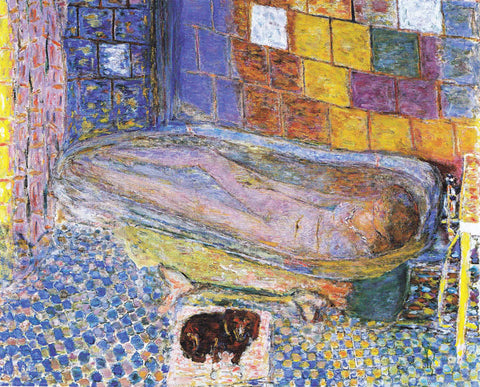 “Nude in the Bath and Small Dog” (1941-6) Bonnard


 “
“
 Paul Cezanne “Apples and Oranges” 1899


